
Branding | Illustration | Graphic Design | UX & UI | HTML, CSS & JS
The Tone Deaf brand first came into being in approximately 2013 when an Irish musician and teacher opened his own of school of music with a clear vision in mind of how he wished to present this school to the world. I was brought on board to make this vision a reality. Throughout the course of almost a decade, the Tone Deaf brand has developed and grown, expanding into new territories and diversifying its core requirements.
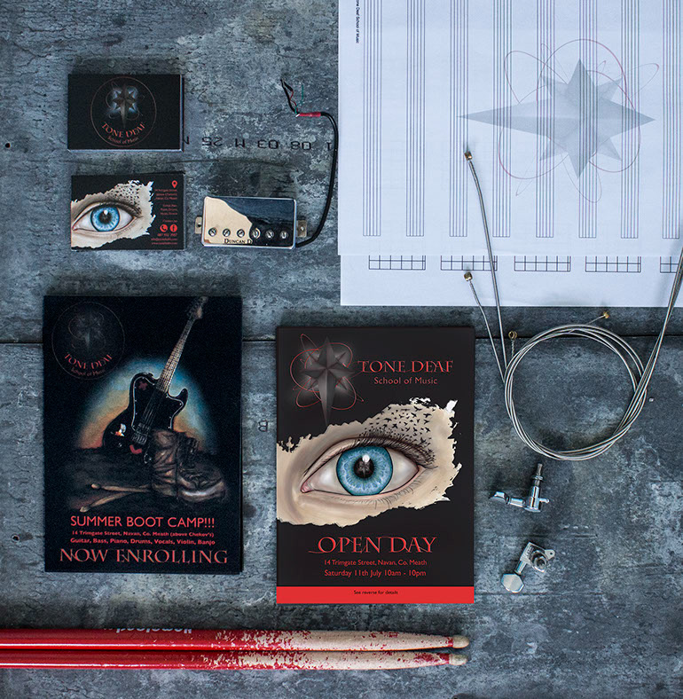
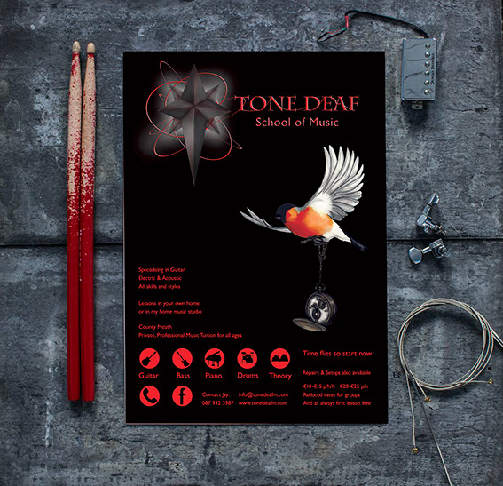
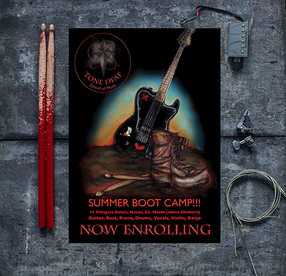
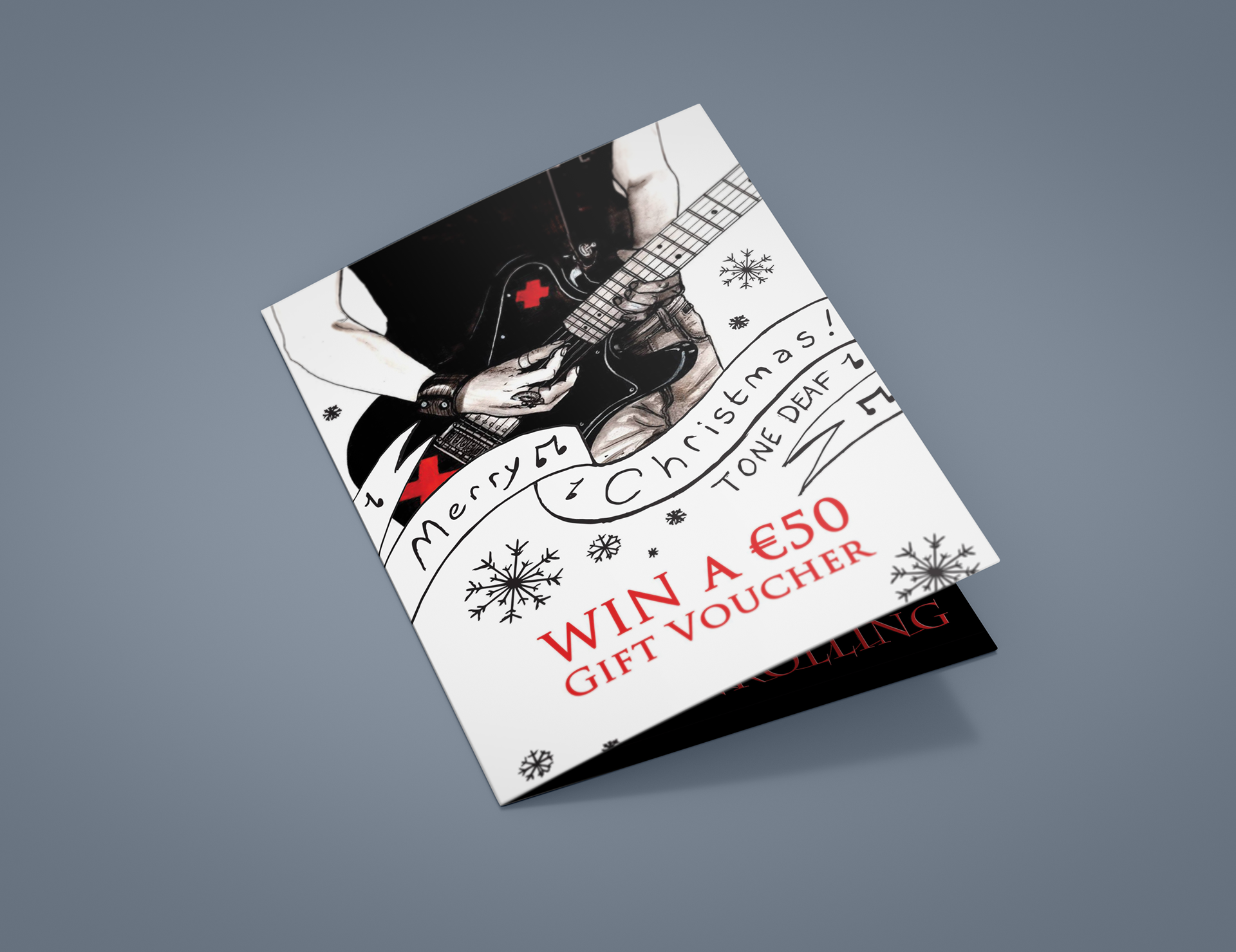
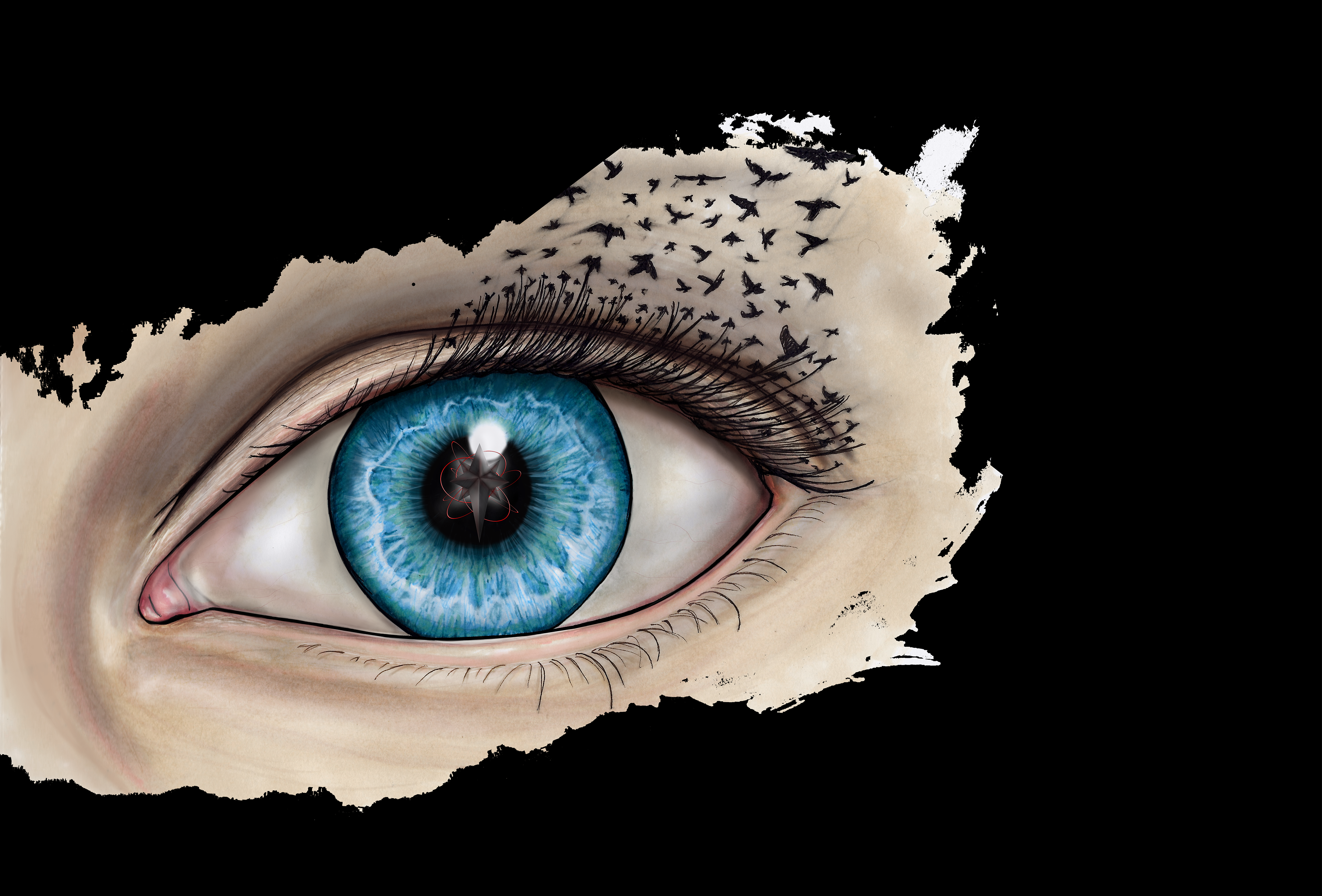
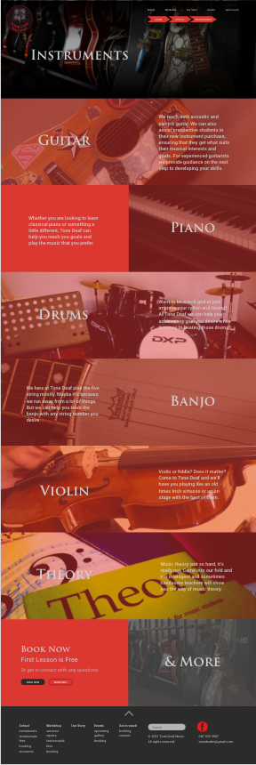
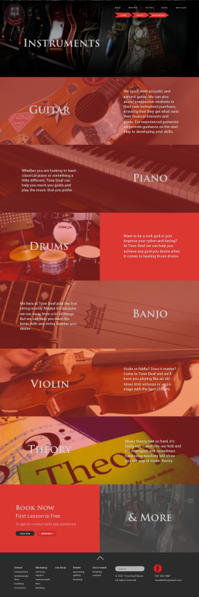
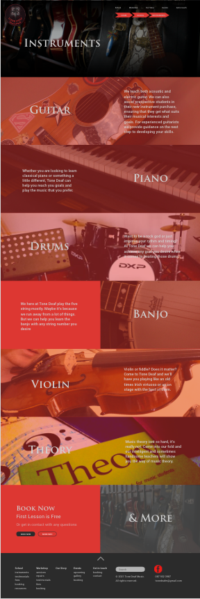
The Tone Deaf School of Music logo, inspired by the nautical star, underwent a number of revisions in its early days, prior to its current realisation. This logo has been applied to a wide range of media, inclusive of (but certainly not limited to) a suite of stationary for business promotions and networking, a range of print advertisements, signage and web content. A core component of the brand was the incorporation of illustrations. Each new campaign was accompanied by a unique new illustration, which would be applied to all relevant media.
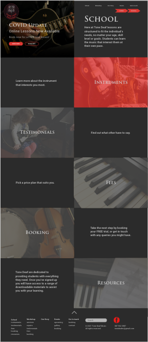
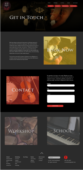
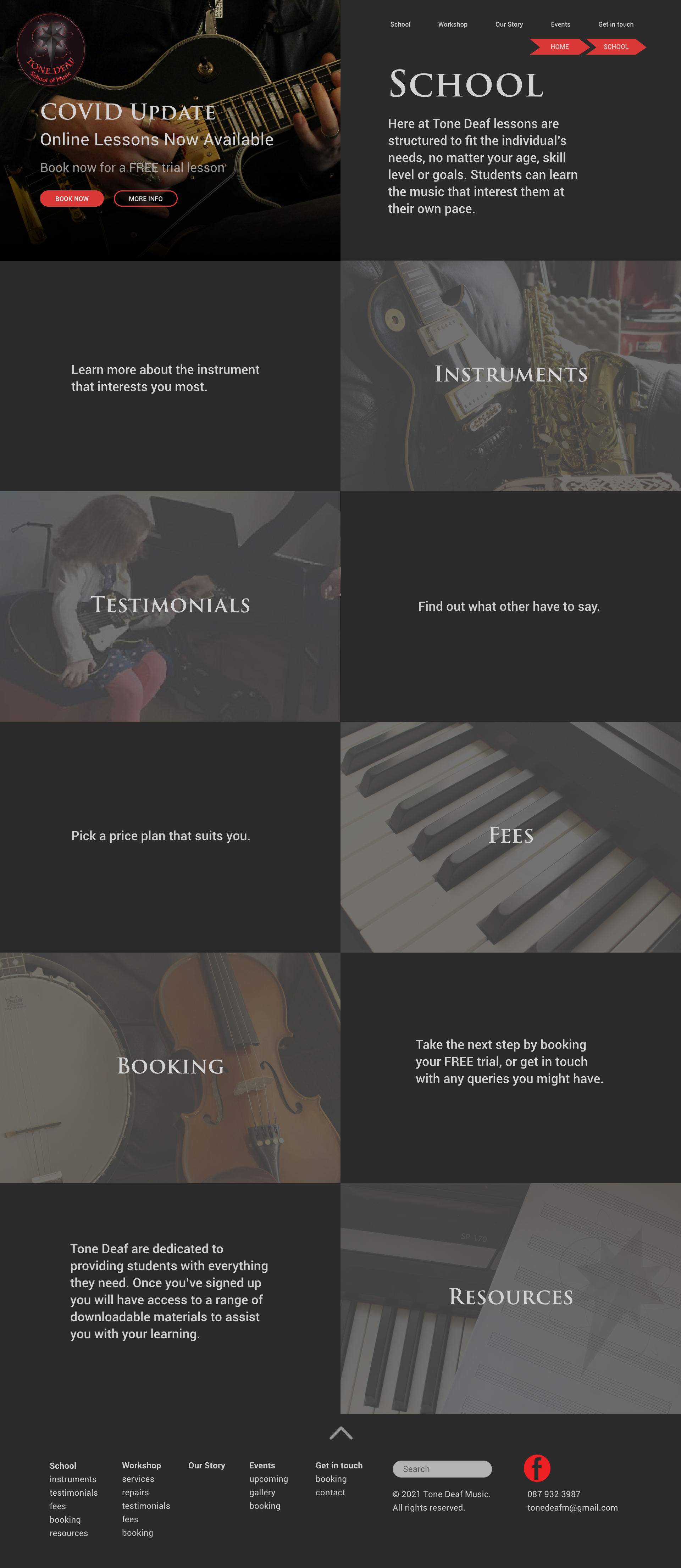
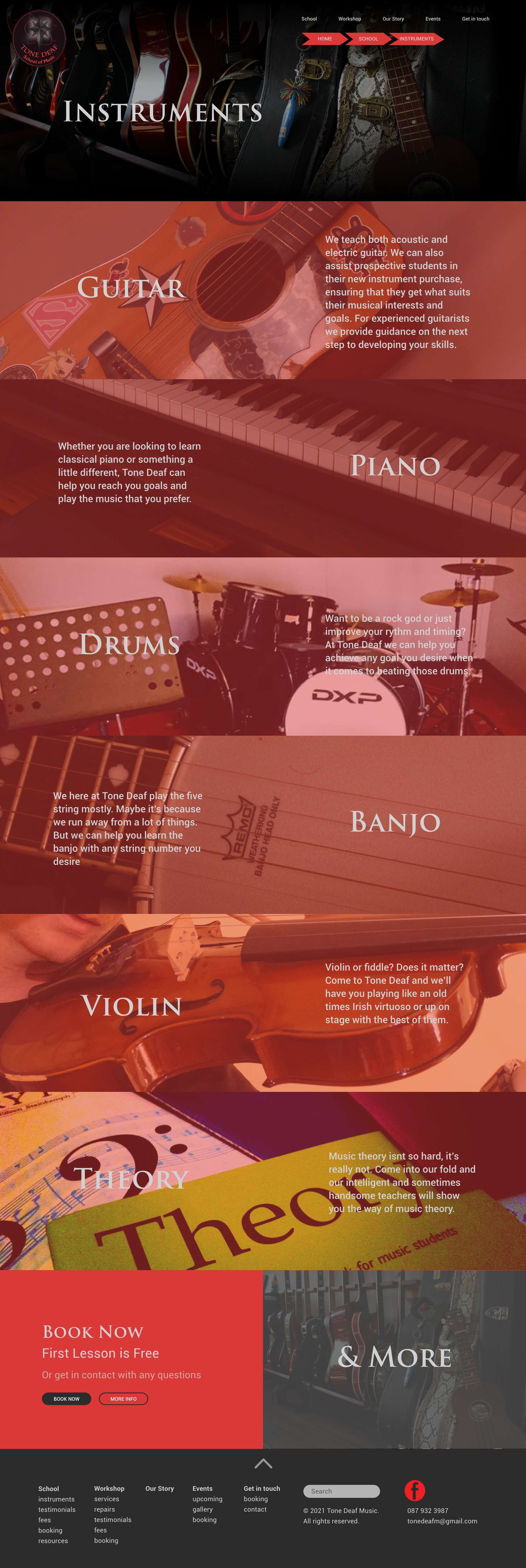
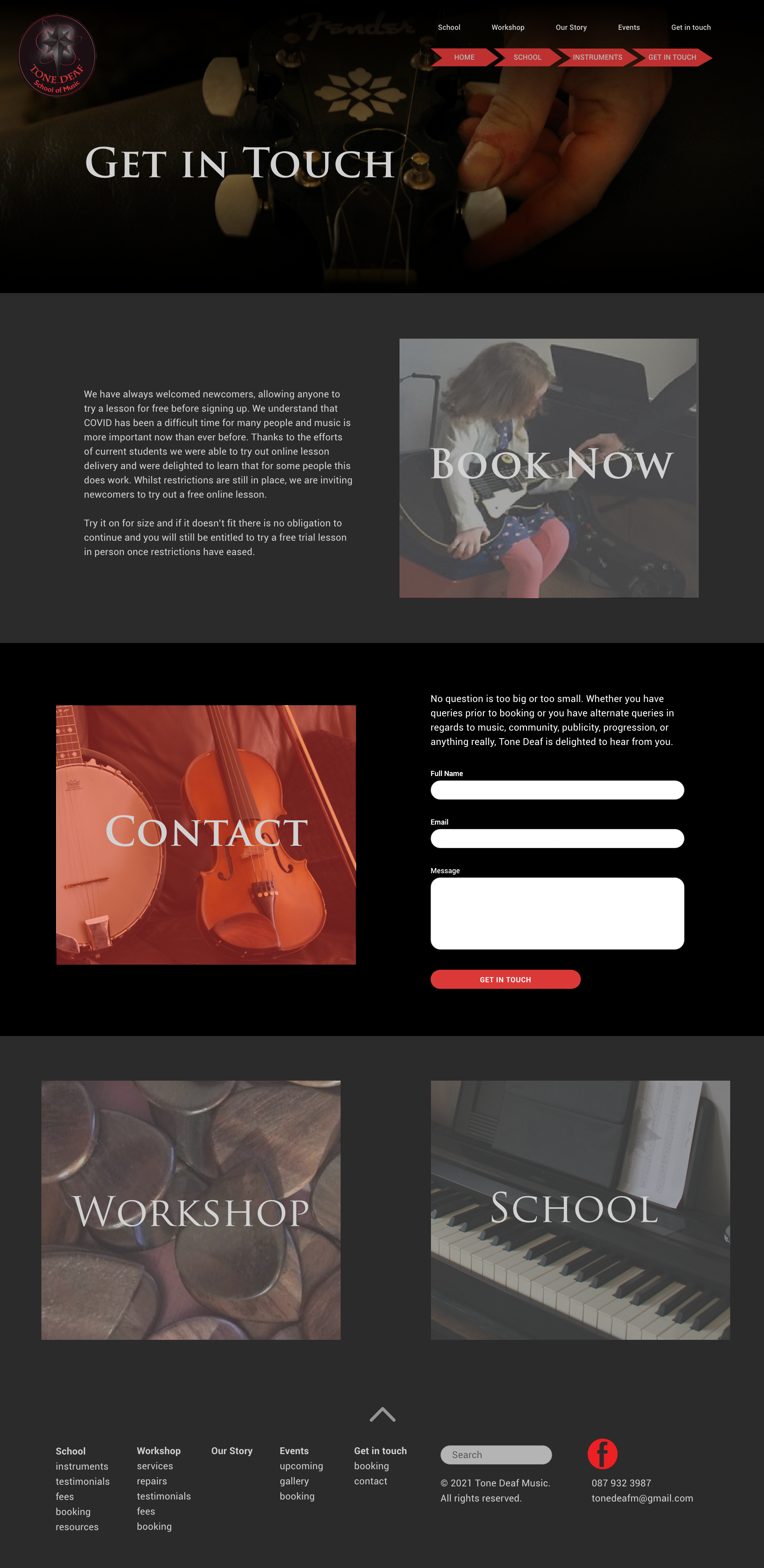
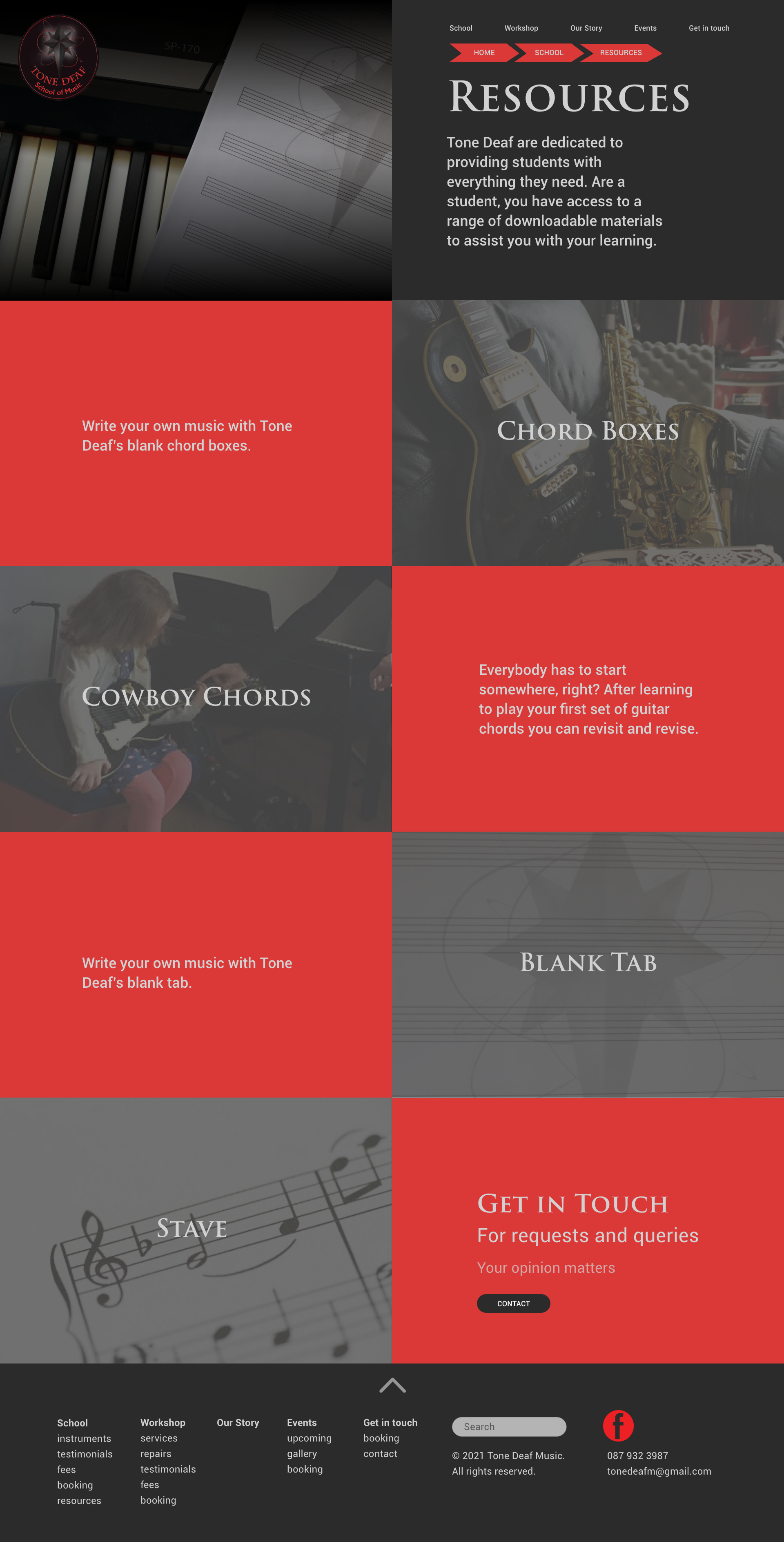
In 2014 I created a website for Tone Deaf School of Music, through the software Adobe Muse. At this time, I had little experience with web design. This website acted as a support to the business in the form of advertisement and was accompanied by many other means, making it less essential.
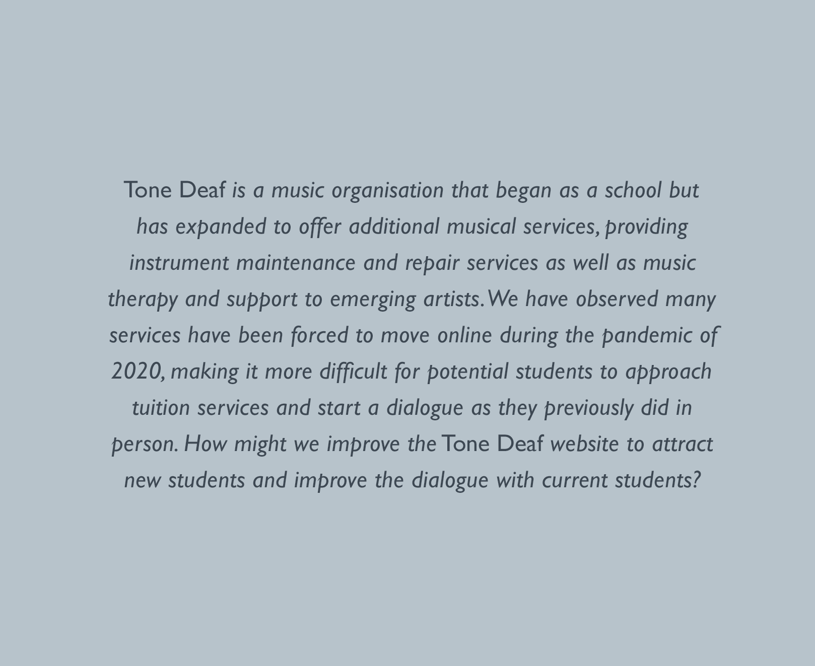
Due to the onset of the global covid pandemic, Tone Deaf, like many others, were forced to adapt to the new ways, providing online lessons to individuals being among these new ways. This meant that the was a far more vital resource than in the past. In the 7 years since the website was initially conceived, the business has undergone developments that also need to be reflected in their online portal.
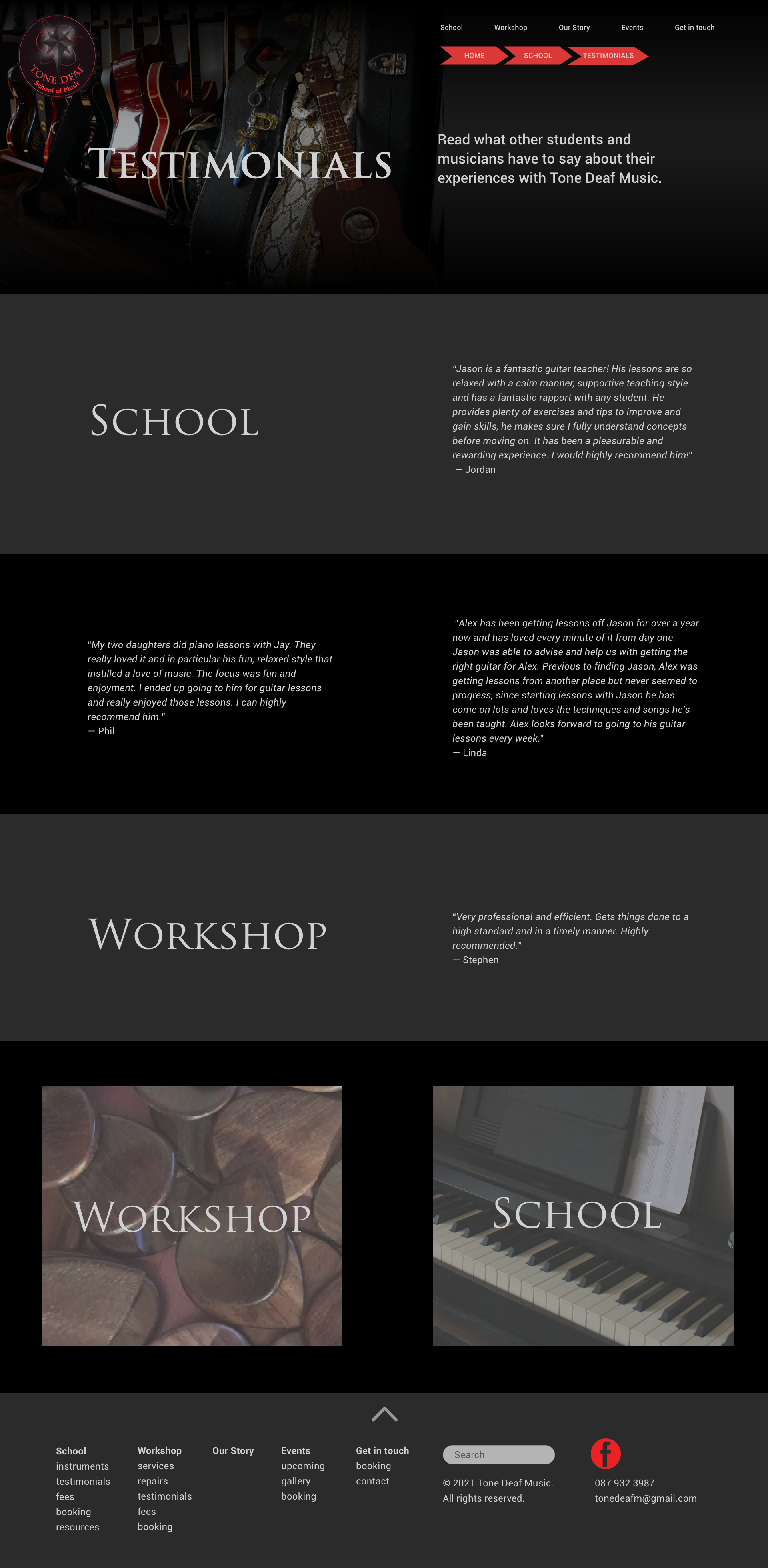
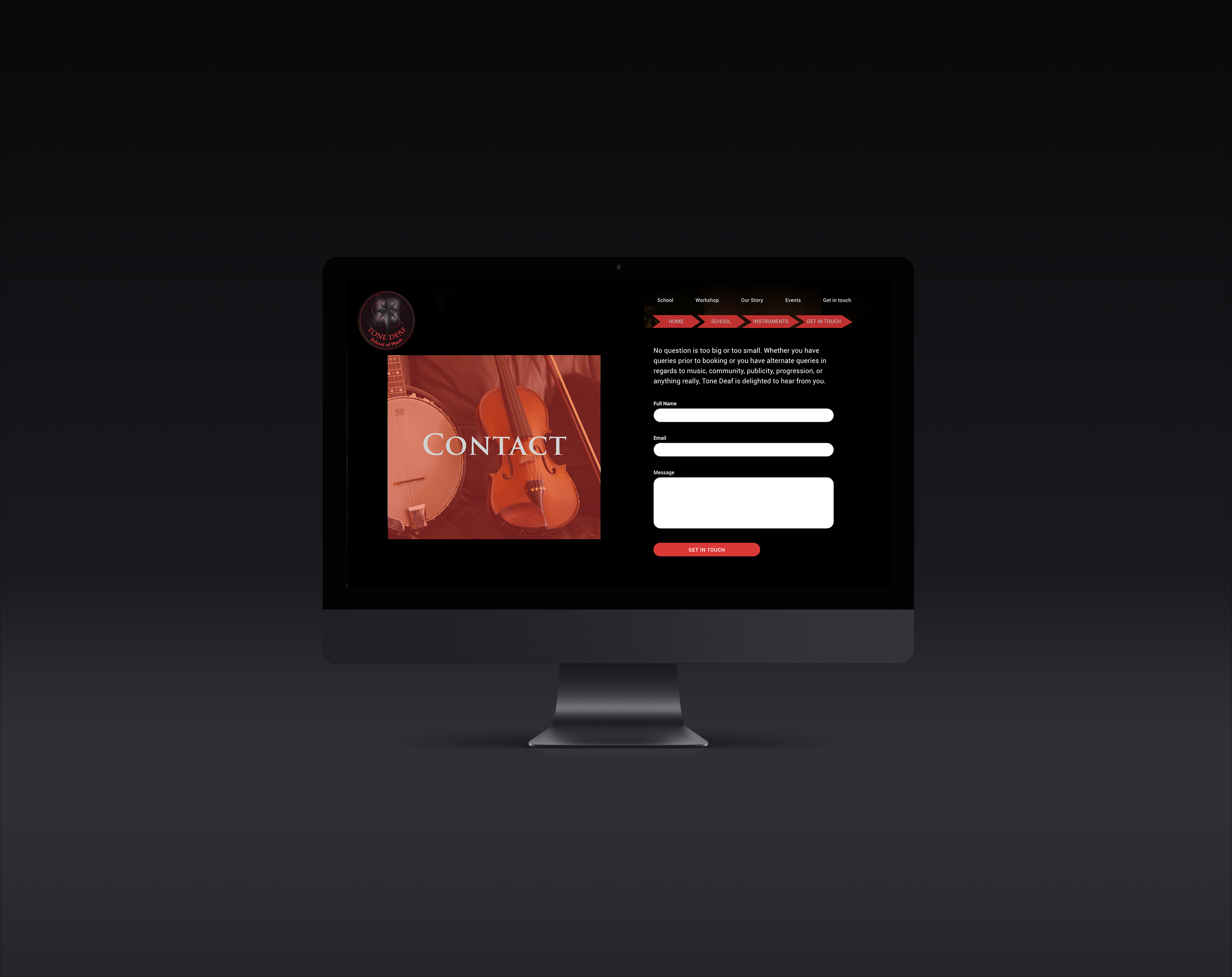
For this revised website, I produced prototypes using Adobe XD, which I later developed through html, css and JS.
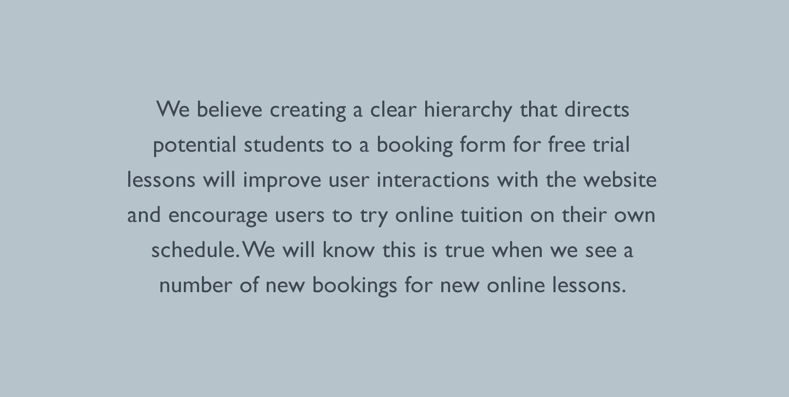
Initial research included an thorough reassessment of Tone Deaf’s previous web offering, an in depth competitor analysis, declaring assumptions that led to the development of a problem statement.
Additional research was conducted through interviews with past and current students, an online survey and meetings with the client to establish further requirements.
As this is a brand that I have been involved with for a great number of years, with a strong social media following, obtaining survey participants from the target cohort was an easily manageable process and the collected research allowed for me to create a hypothesis statement.
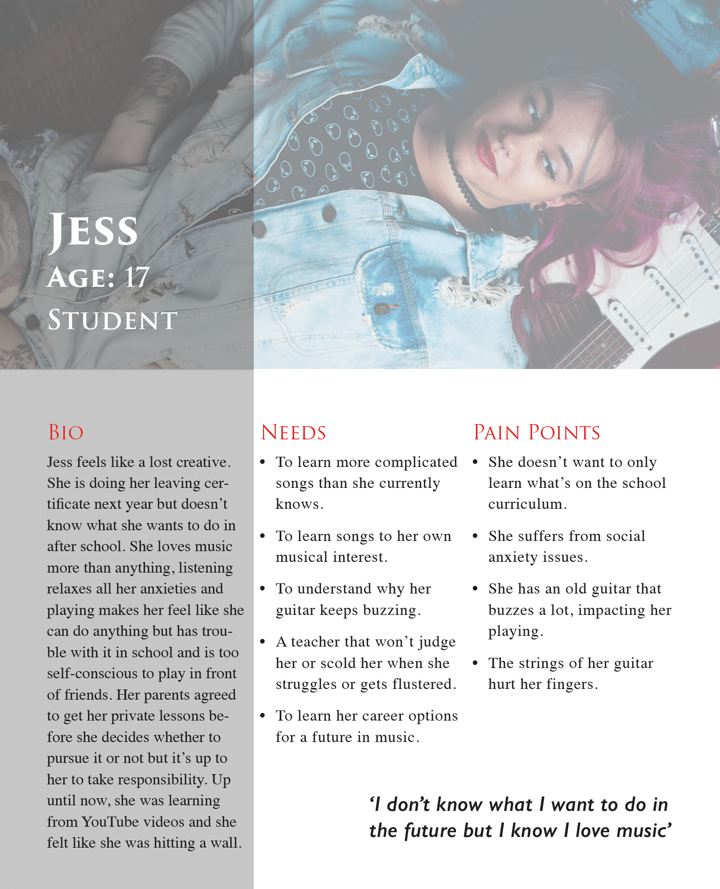
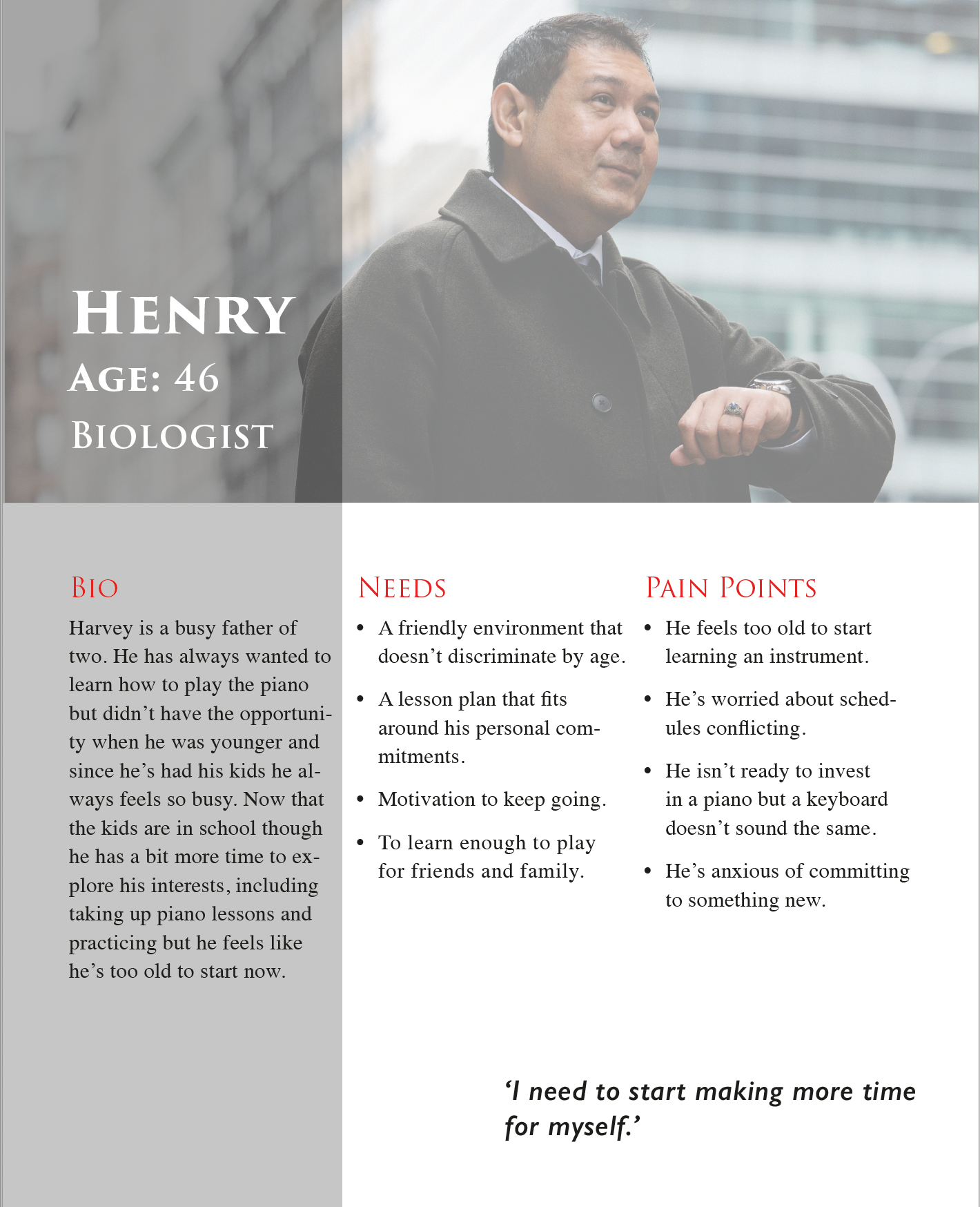

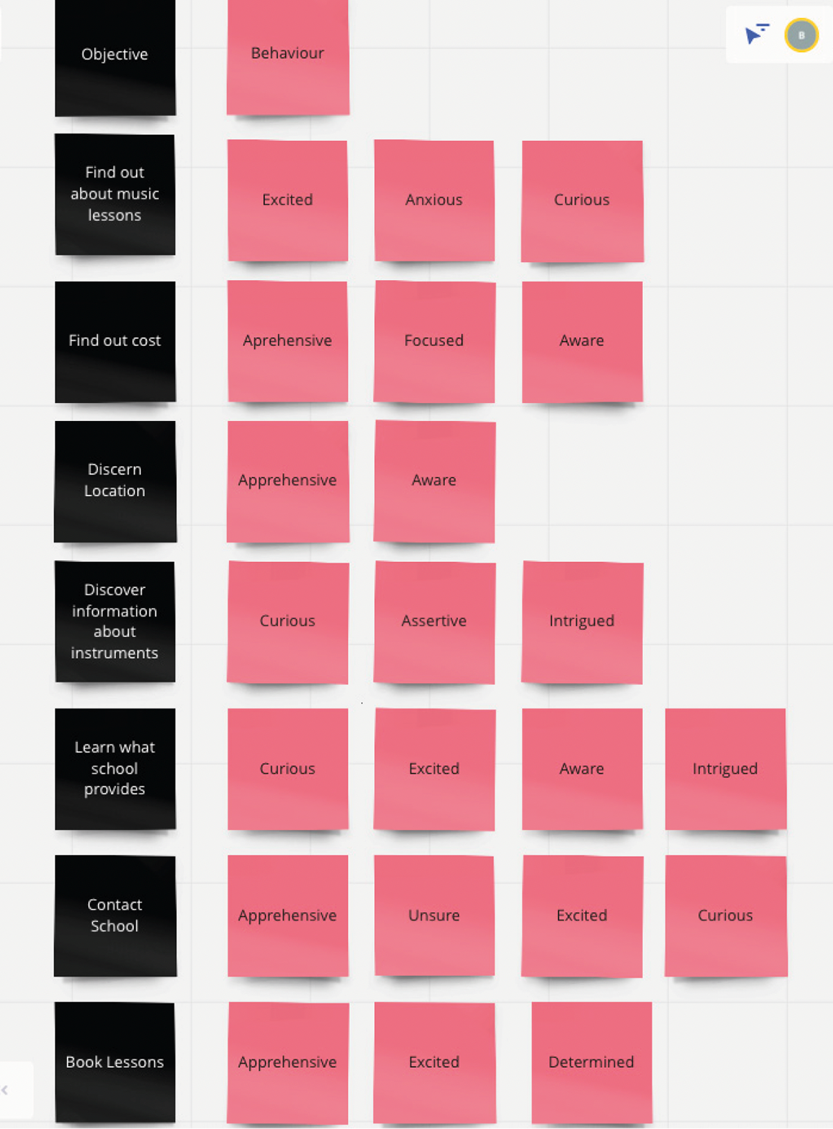
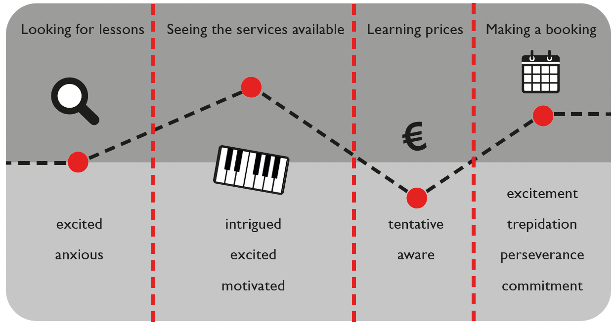
The next step was to develop personas to aid in the process going forwards. Then, the user’s journey was considered through experience mapping, allowing me to highlight certain touchpoints. I used digital post-its, in Miro, to quickly ascertain important objectives and brainstorm the emotional affect certain activities have on the user before synthesising this into a simple customer journey map that revealed a number of potential opportunities. .
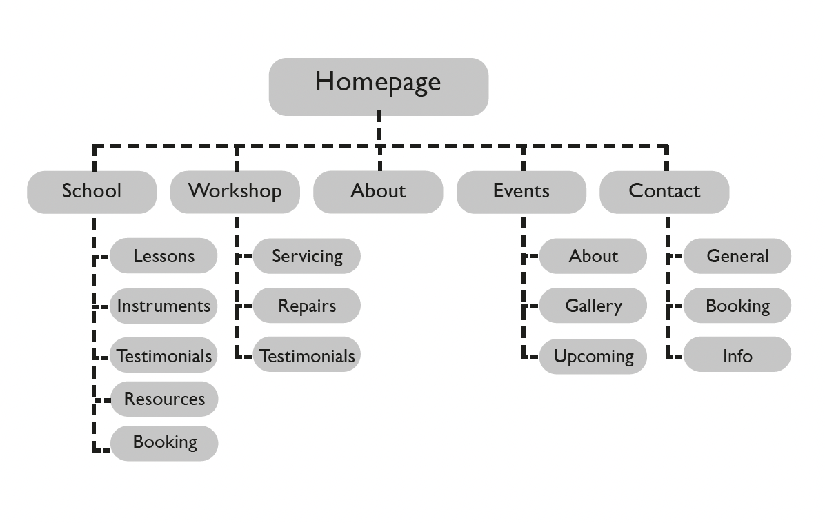
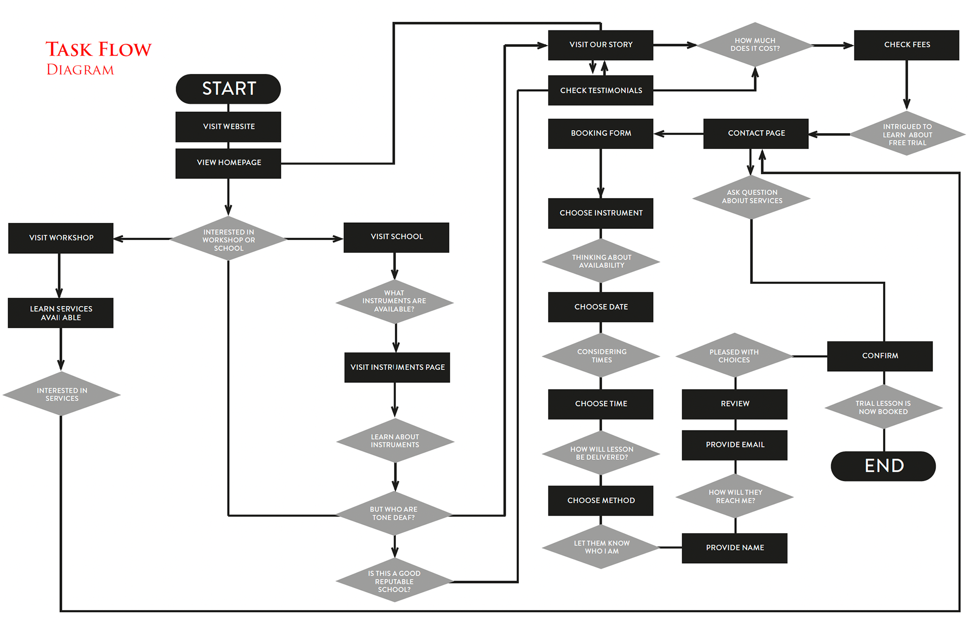
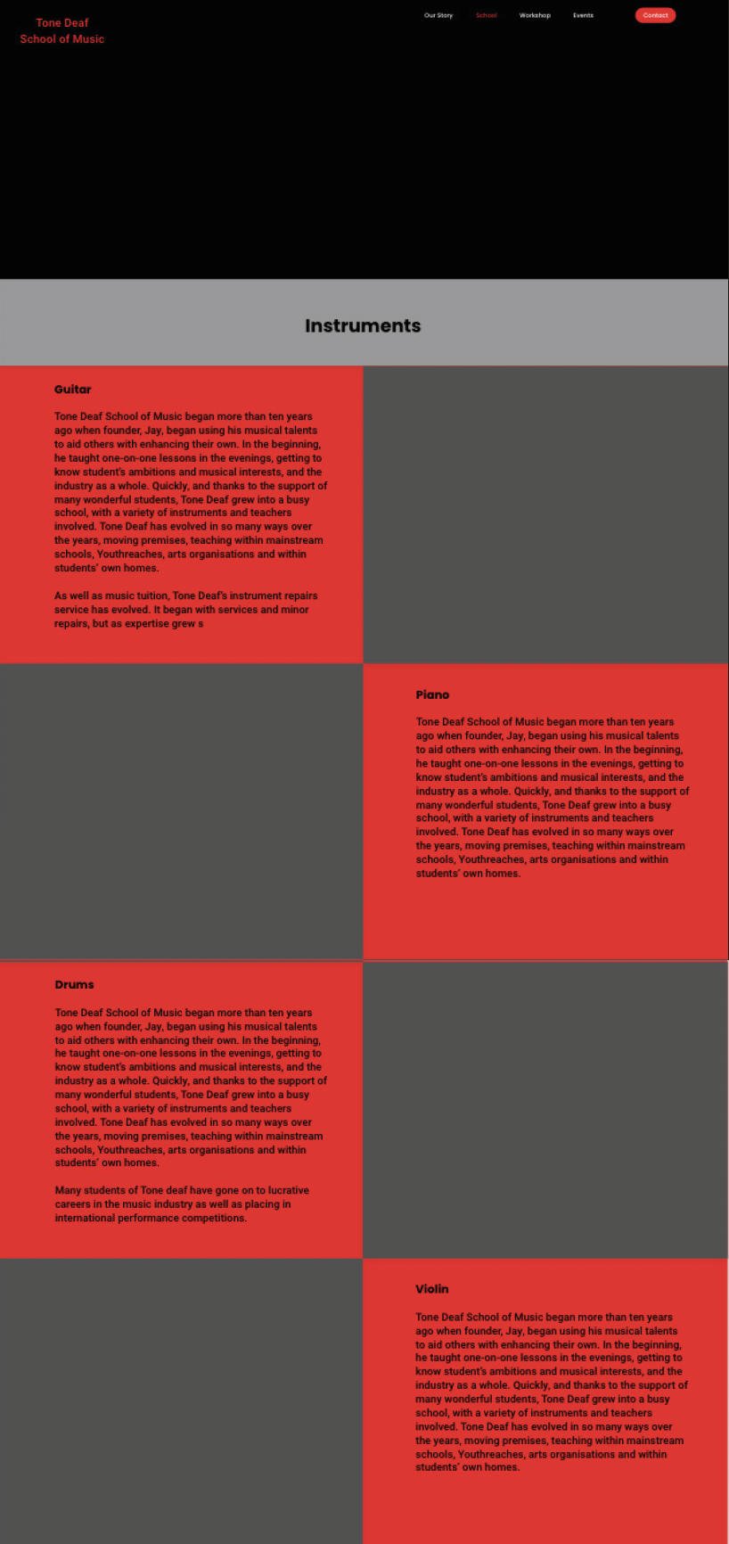
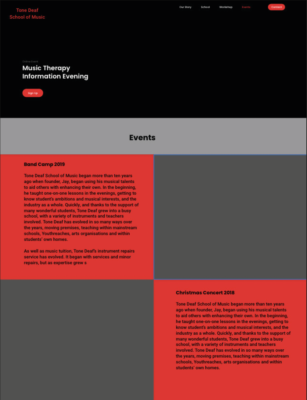
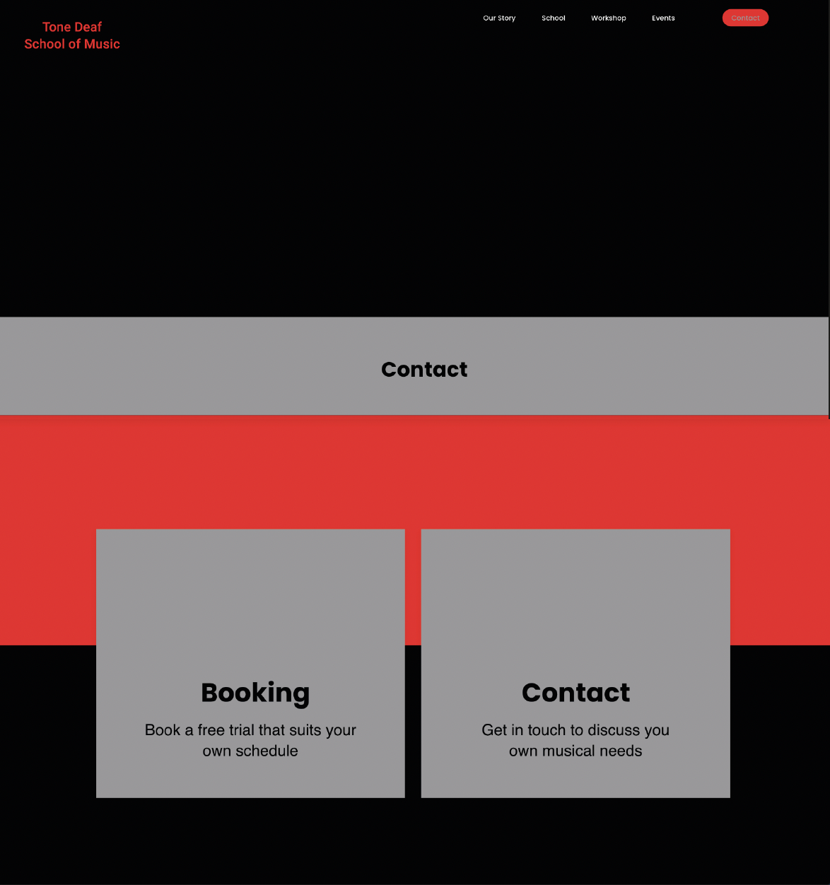
With a focus on information architecture, materials produced in the development of the physical site included a content inventory, sitemap and task flow diagram.
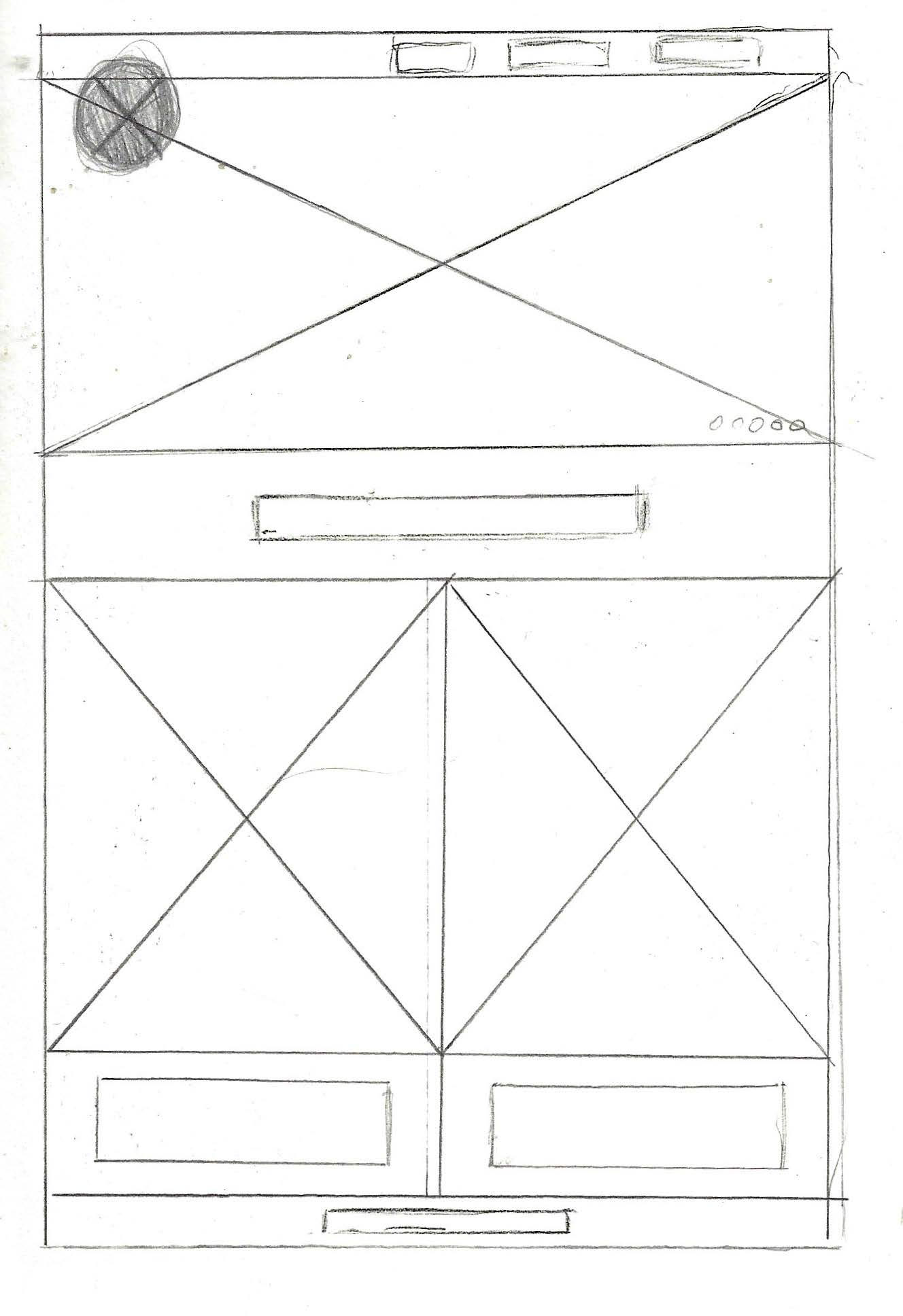
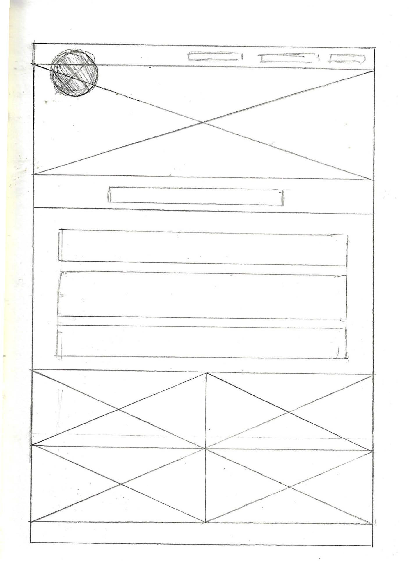
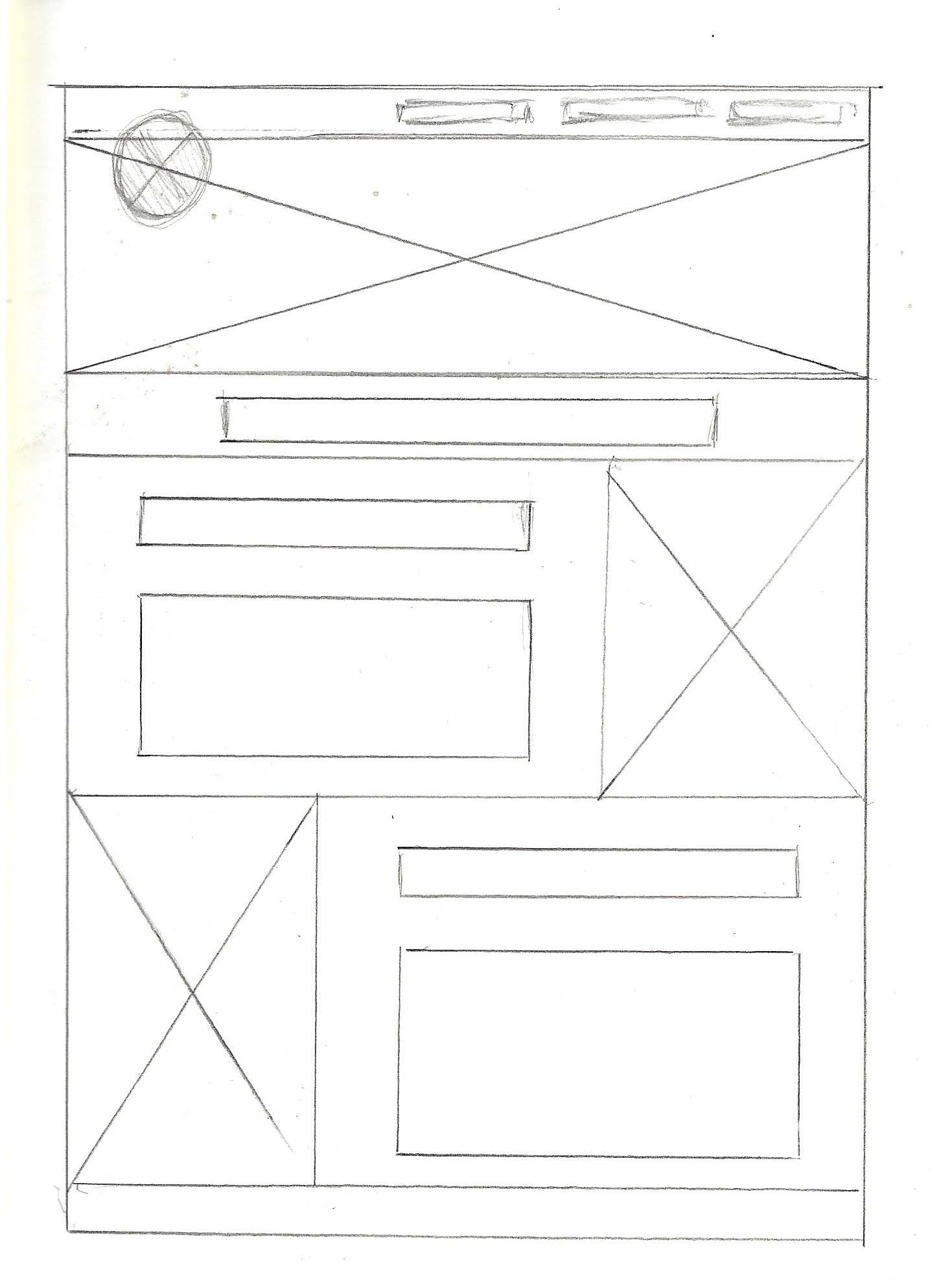
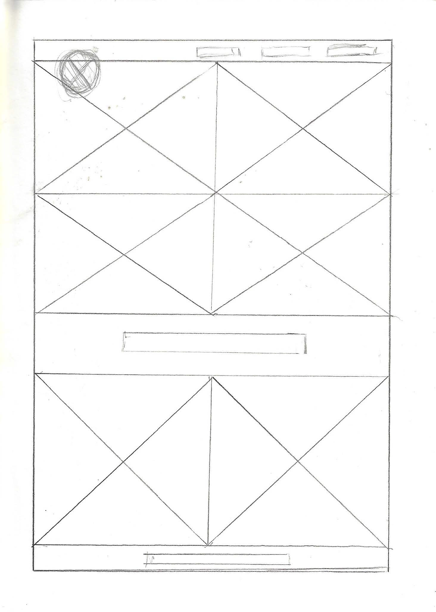
With all of this in place it was then possible to begin wireframing.
Next, an MVP was created focusing on pages of the site that research revealed were the highest priority. Three usability studies were then conducted, with a number of testing participants.
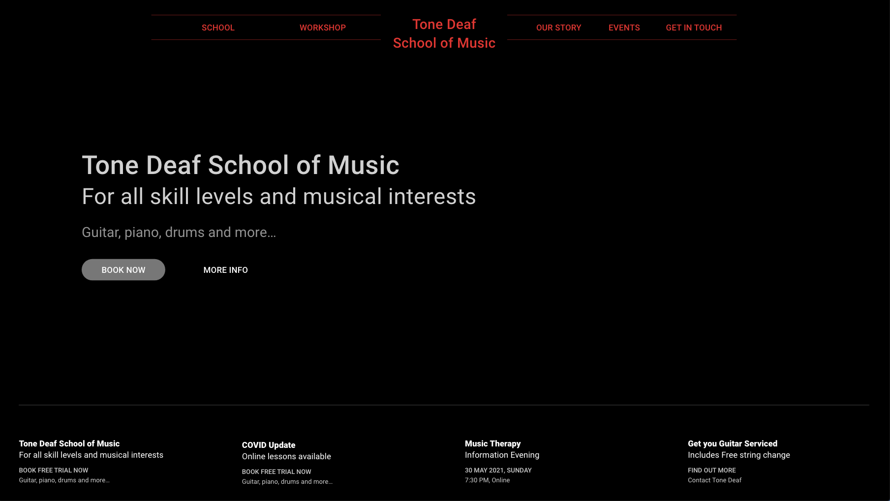
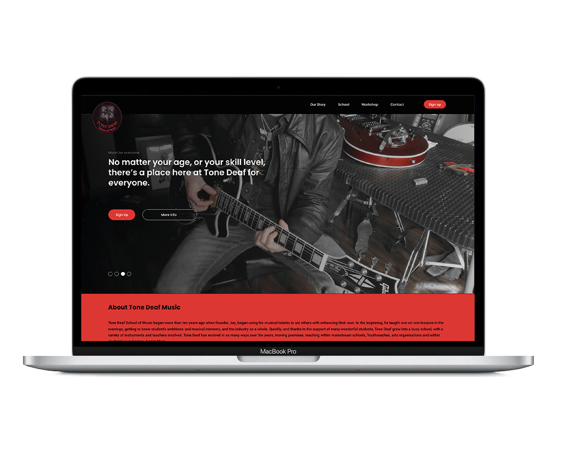
The initial study led to the development of a more refined MVP before creating a high fidelity prototype, which also underwent refinement following the third phase of user testing.
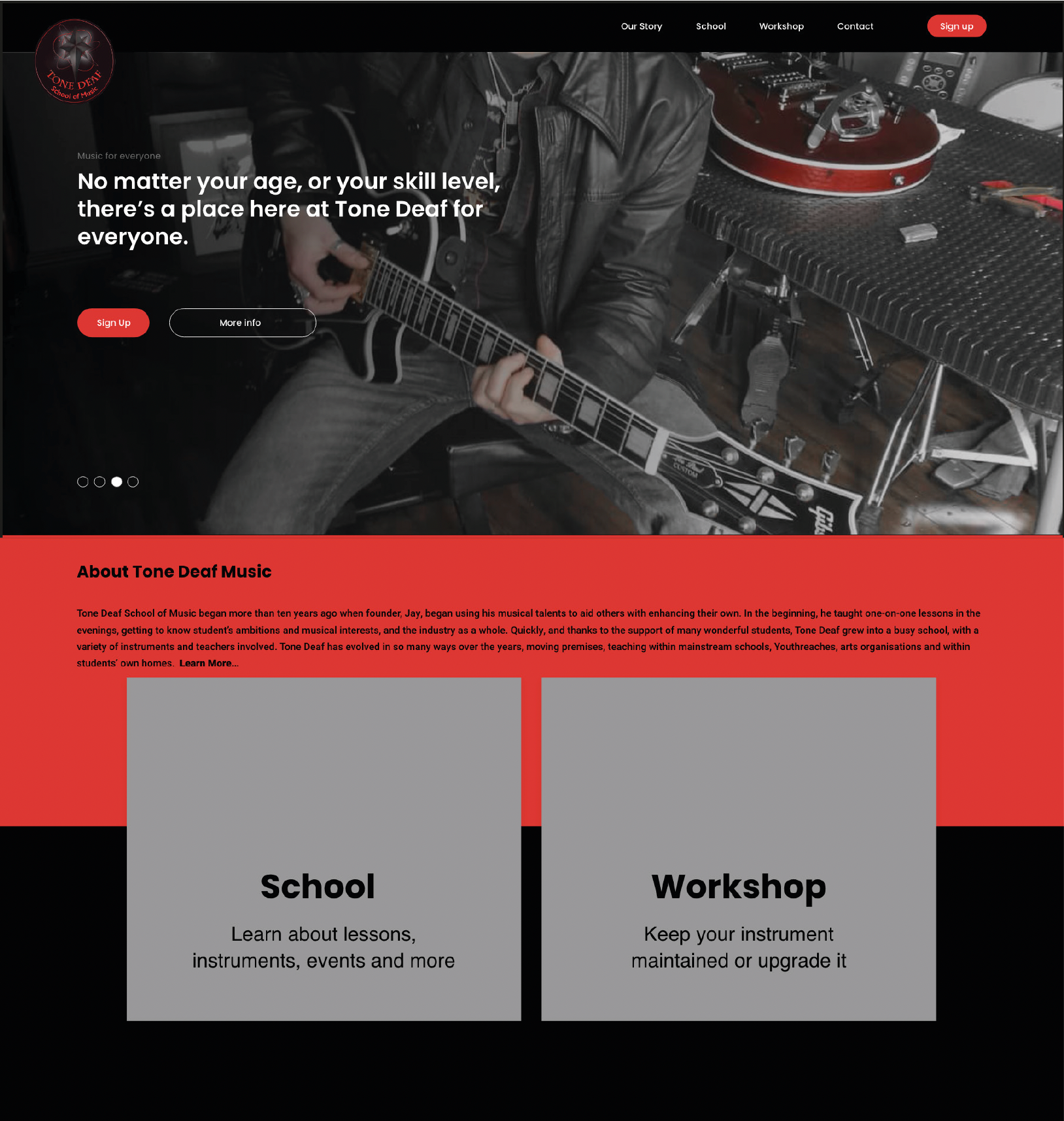
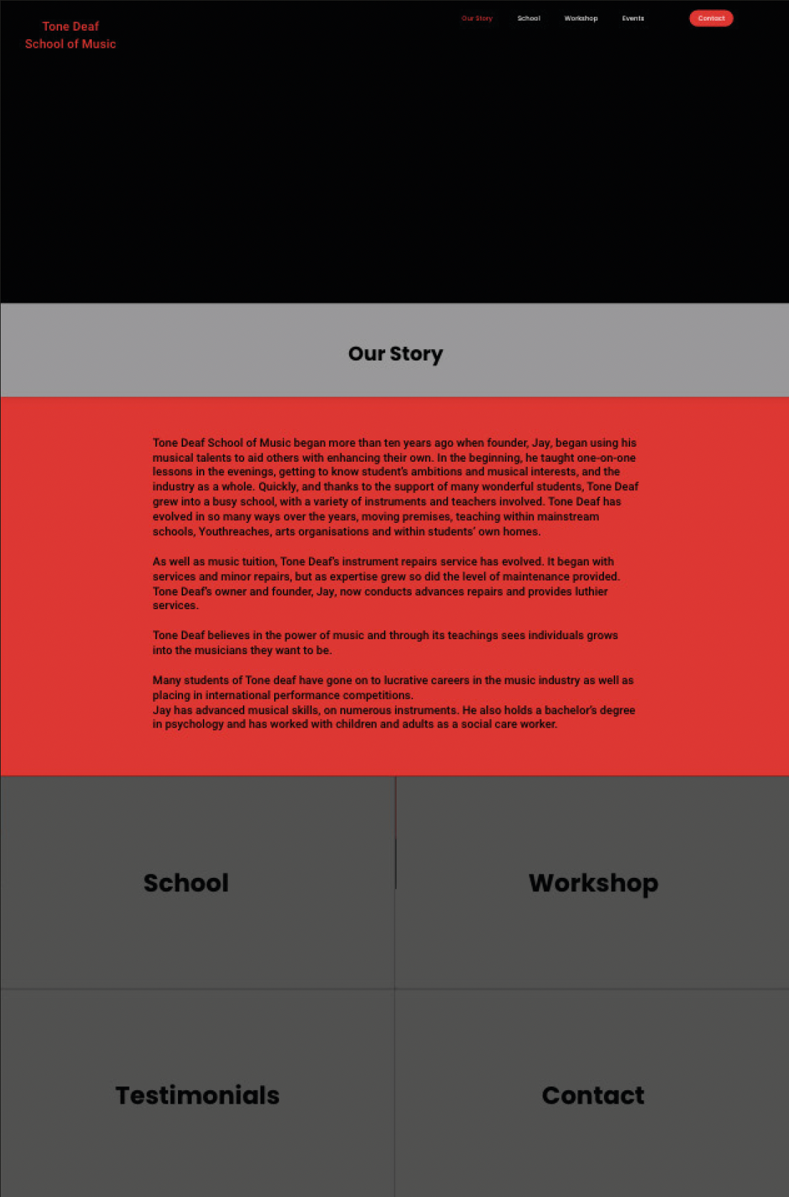
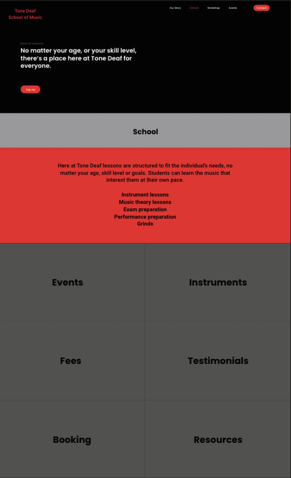
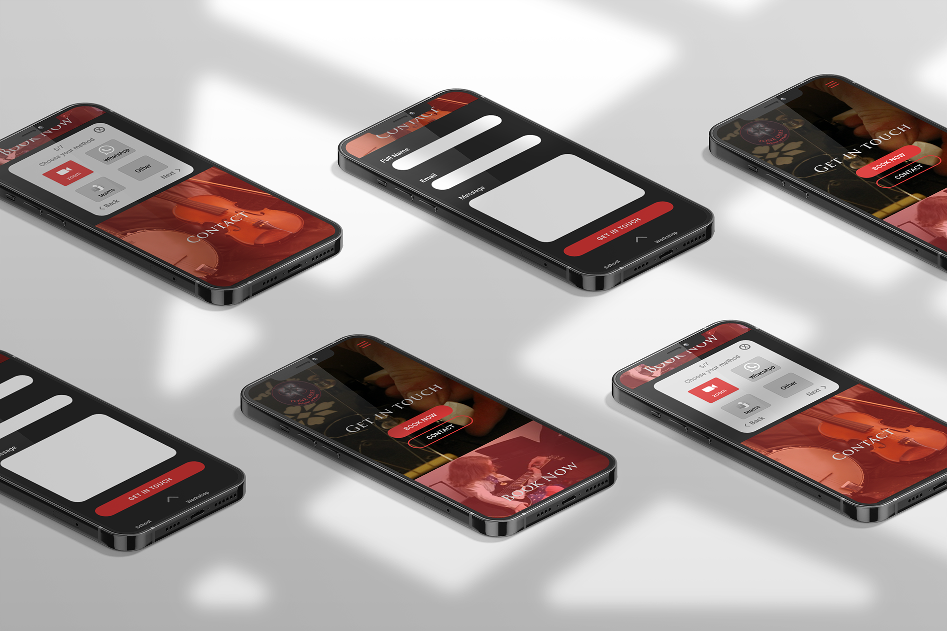
An object’s ability to convey function through sensory means was an important consideration when developing Tone Deaf’s website. Therefore, affordances were utilised in the visual design to lead users to interact with objects. As Tone Deaf has a lot of information to communicate, affordances were used in conjunction with progressive disclosure techniques to create a better user experience.
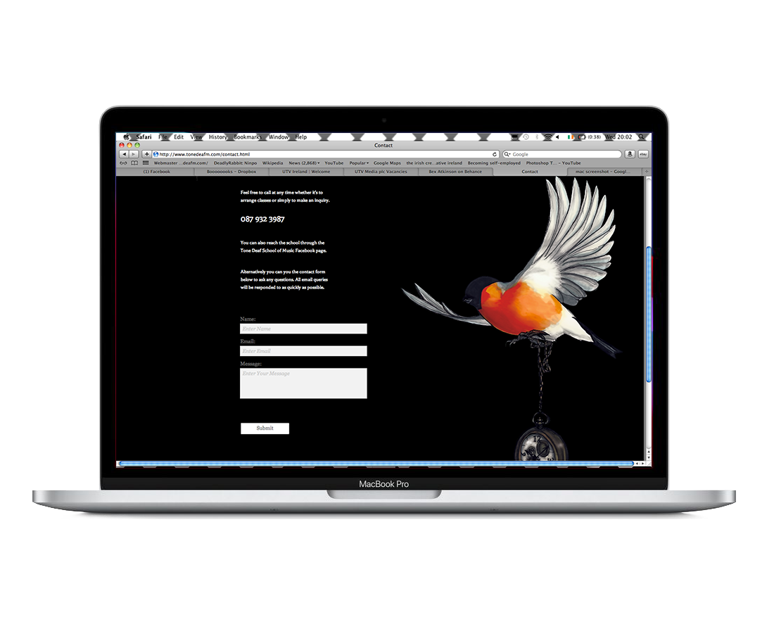
A desktop high fidelity prototype is available at the link below:
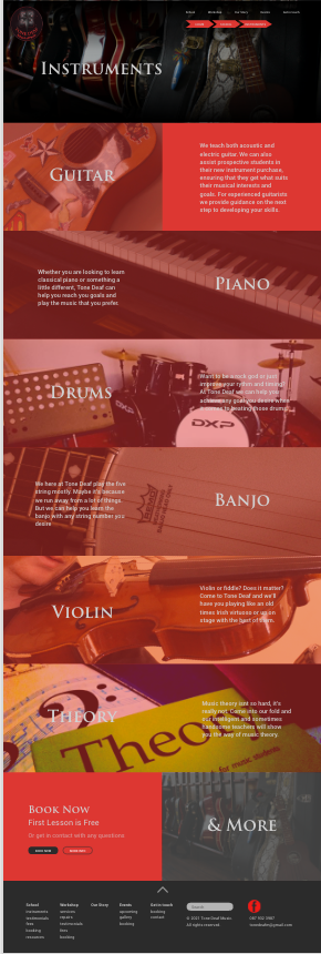
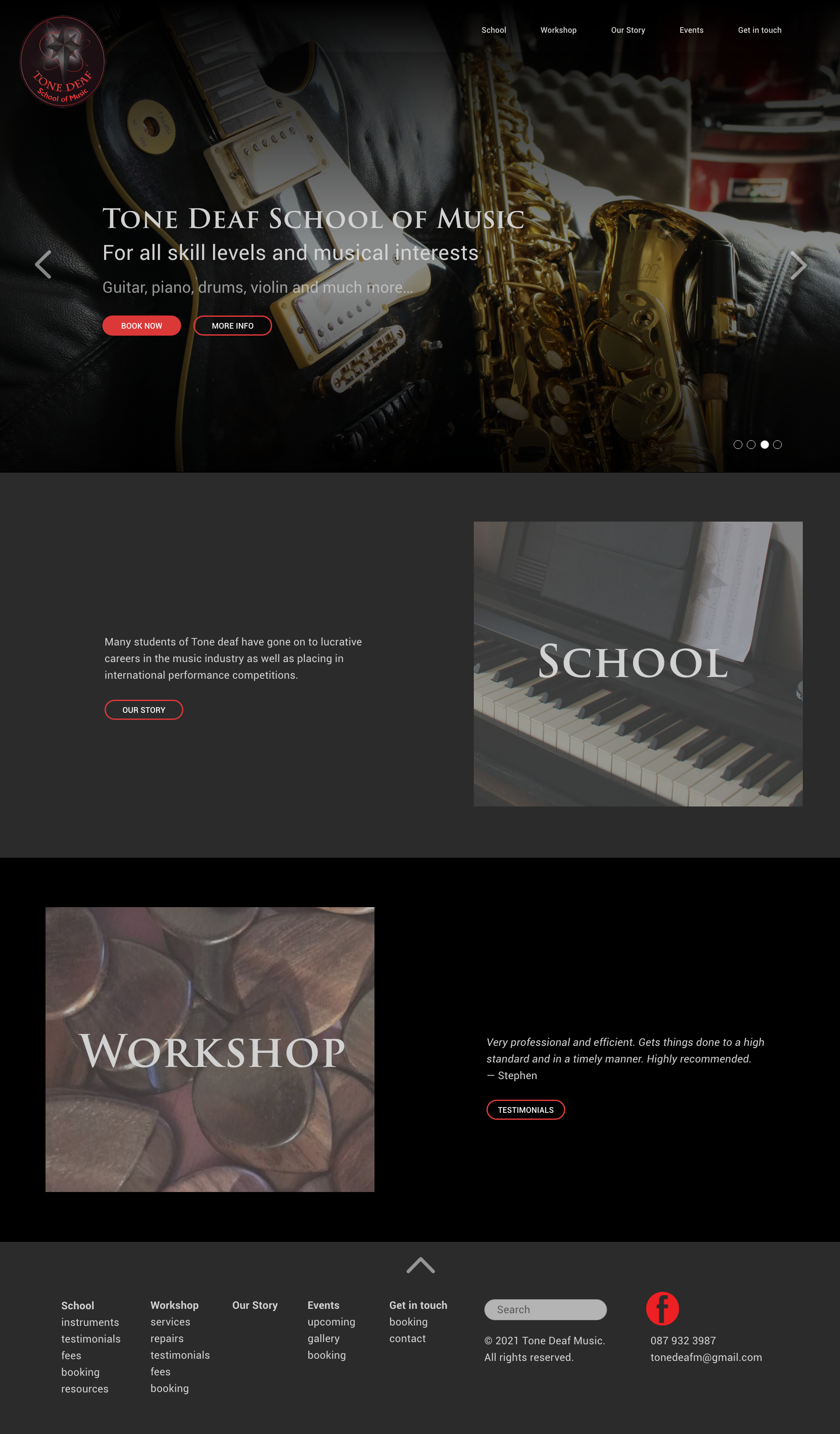
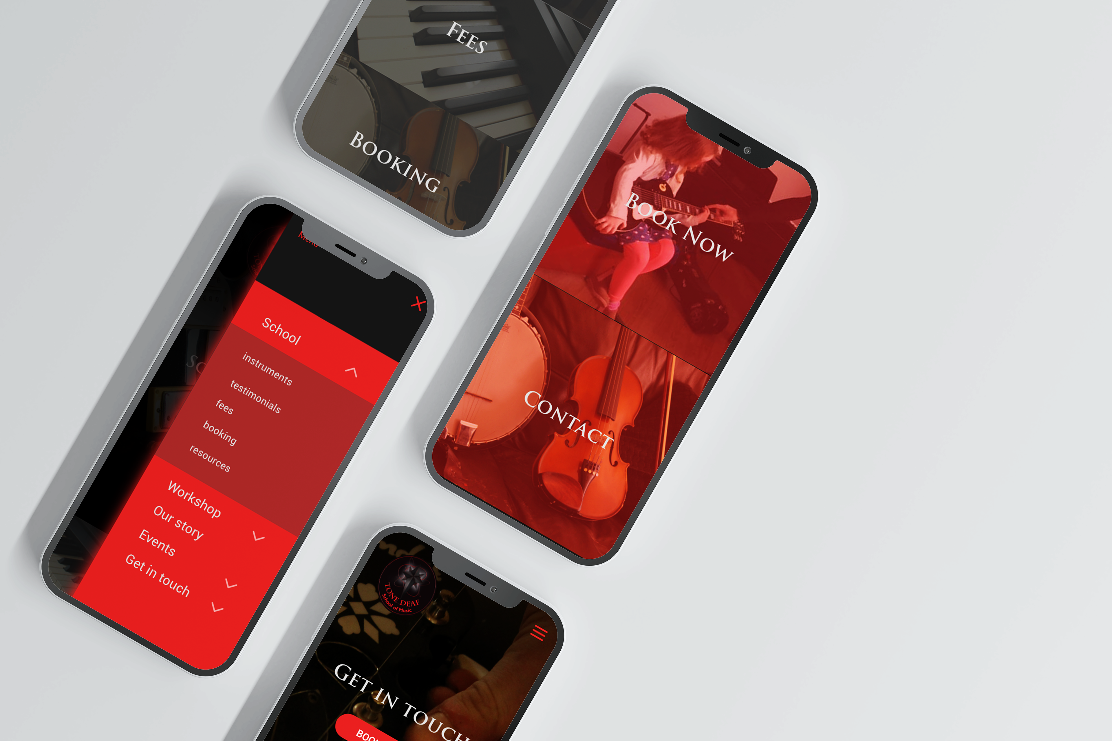
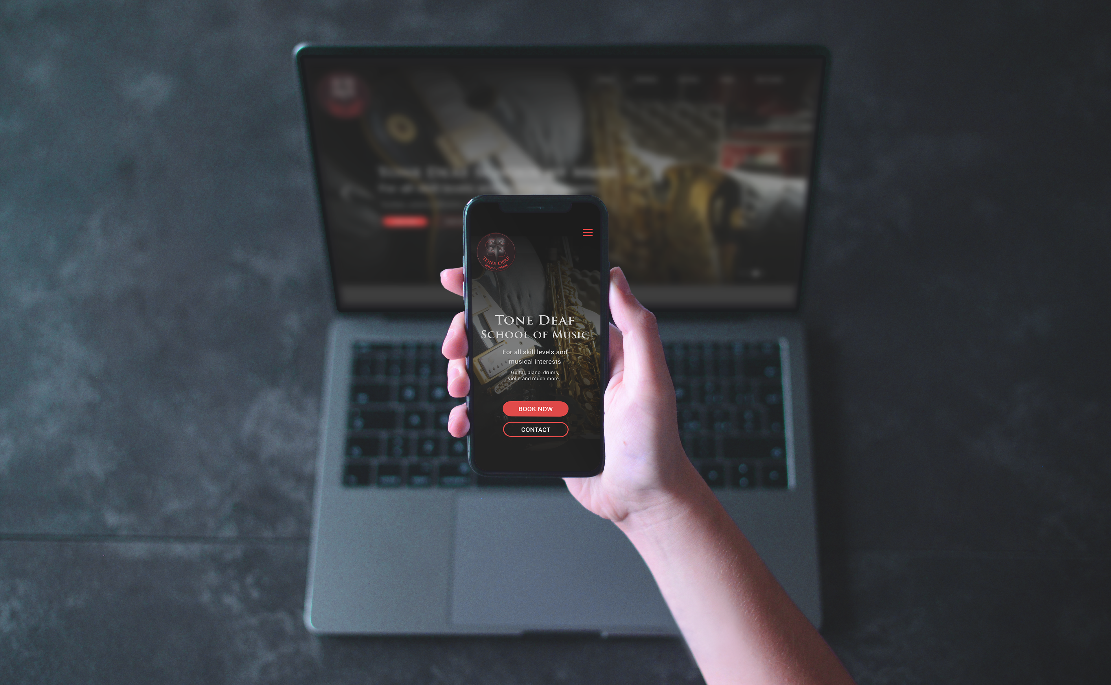
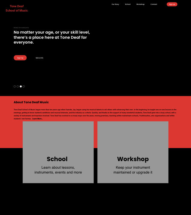
Additionally, whilst the primary objective was to develop a revamped desktop site, this design was also adapted for mobile devices with particular consideration applied to mobile design principals.
A mobile high fidelity prototype is available at the link below: