UX & UI Design
TravelMaster is an event travel specialist, established in 2017, operating coaches to all leading festivals, concerts and sporting events throughout Ireland. They began in County Cork and grew to include 50 pick up points across 16 counties. They are Ireland’s first 100% digitally enabled event coach service utilising social media and email marketing to create awareness among their specific demographic of 18–40-year-olds travelling to events throughout the year.
At this time, the company were seeking to develop a specific app intended for the driver of the bus to provide a better service to the business’s customers. Through a thorough examination of their current product and system goals, and the problem the business stakeholders are looking to address, it was possible to construct a problem statement as a starting point.
Next, the intention was to build a hypothesis statement, but a number of building blocks were required first: outcomes desired, details of targeted personas and a set of possible features.
Ben Ralph’s Persona Notepad was used to capture what has been learnt up until that point, as ‘A guide, not a template’ (Ralph, 2017). After conducting further research, it was possible to then create a far more cohesive user persona. This new refined persona drew focus to particular pain points in the user journey.
A prioritisation matrix was then created by initially defining needs, refining them, and bringing these to a meeting with the client, where the client to discuss further, with a scoring system utilised to evaluate each need. This resulted in a set of features to work with.
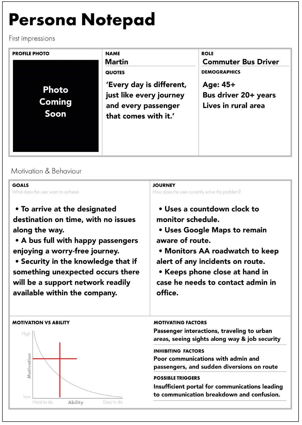
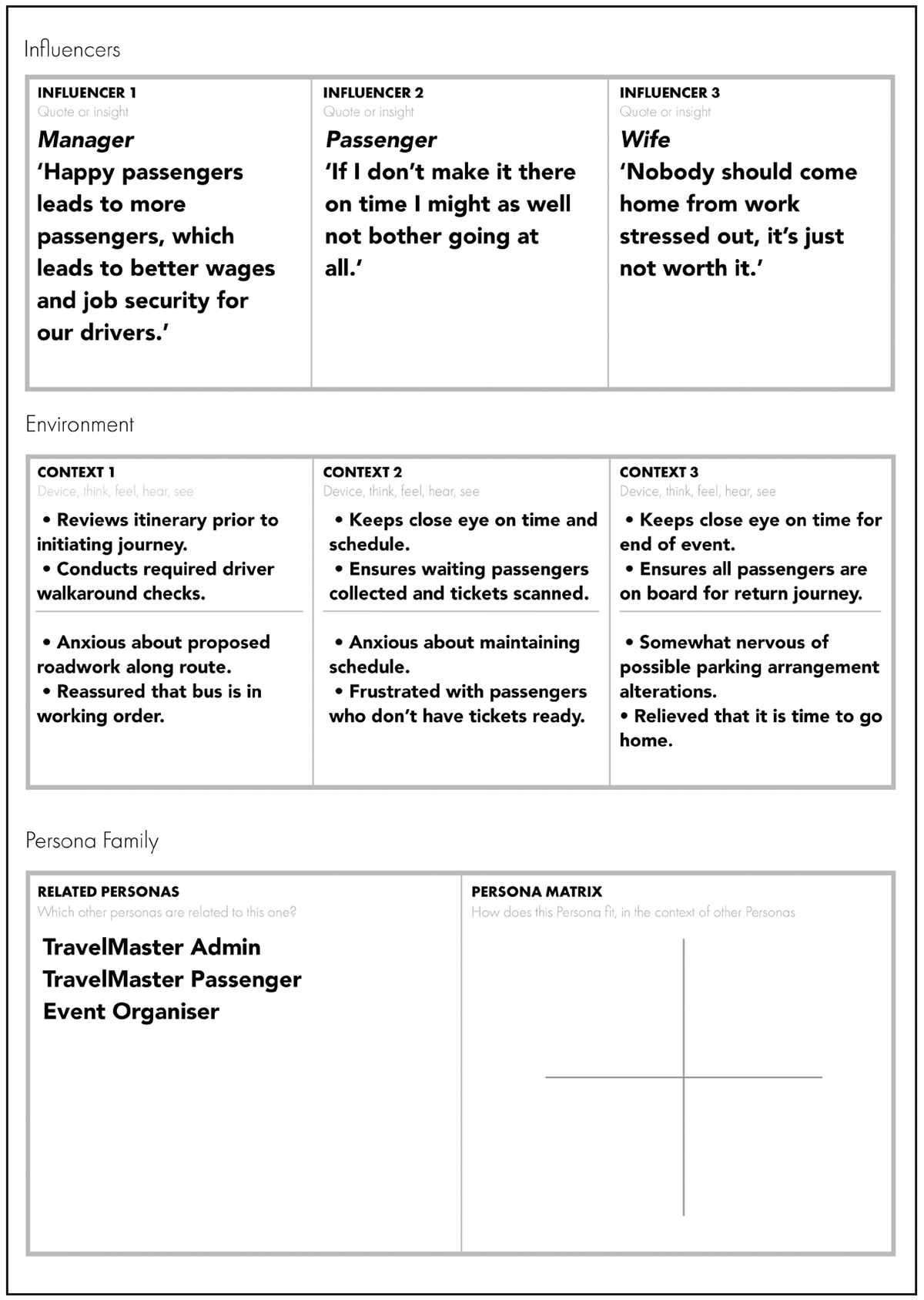
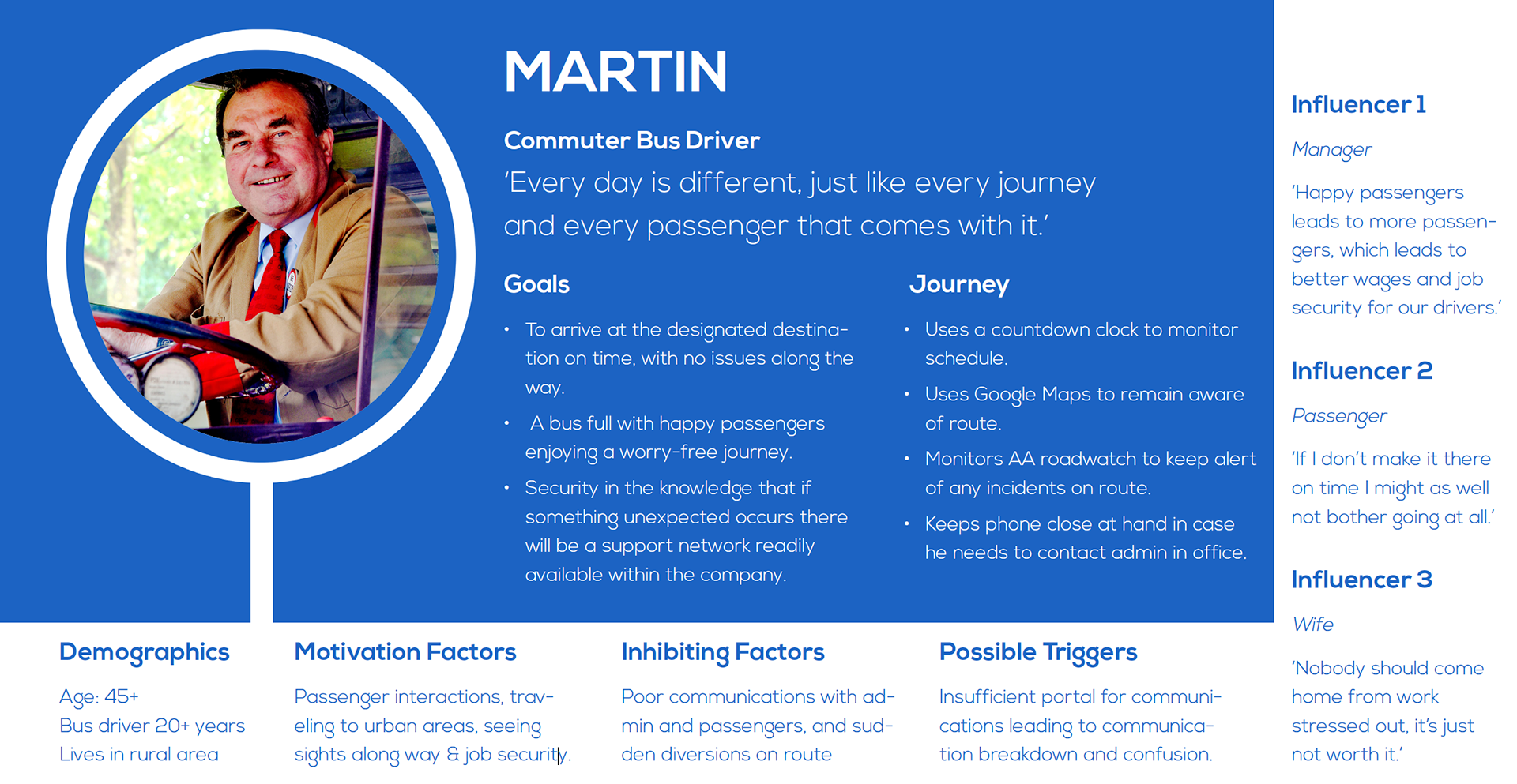
A competitor-benchmarking exercise was undertaken to uncover opportunities or gaps in innovation within the marketplace using a spreadsheet to collect data in a matrix. This saved on time when making a cross-comparison of collected data. Following this, a number of opportunities were highlighted, for further consideration during the design phase.
A survey was also conducted to gather information, with TravelMaster’s own drivers were approached to participate. However, as there was a limited number of drivers available within this group, the survey was sent to a wider pool of external drivers also, with care that no nda requirements were breached. The findings of this survey provided significant information on trends among the bus driver community as well as providing valuable information on potential opportunities allowing ideation to begin.
A number of screens were sketched in the creation of a paper prototype, each intended for a different app function but with the intention of mapping out the interactions and navigation between screens and necessary tasks.
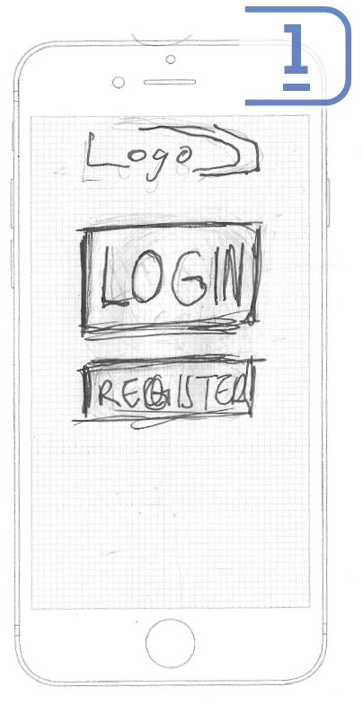
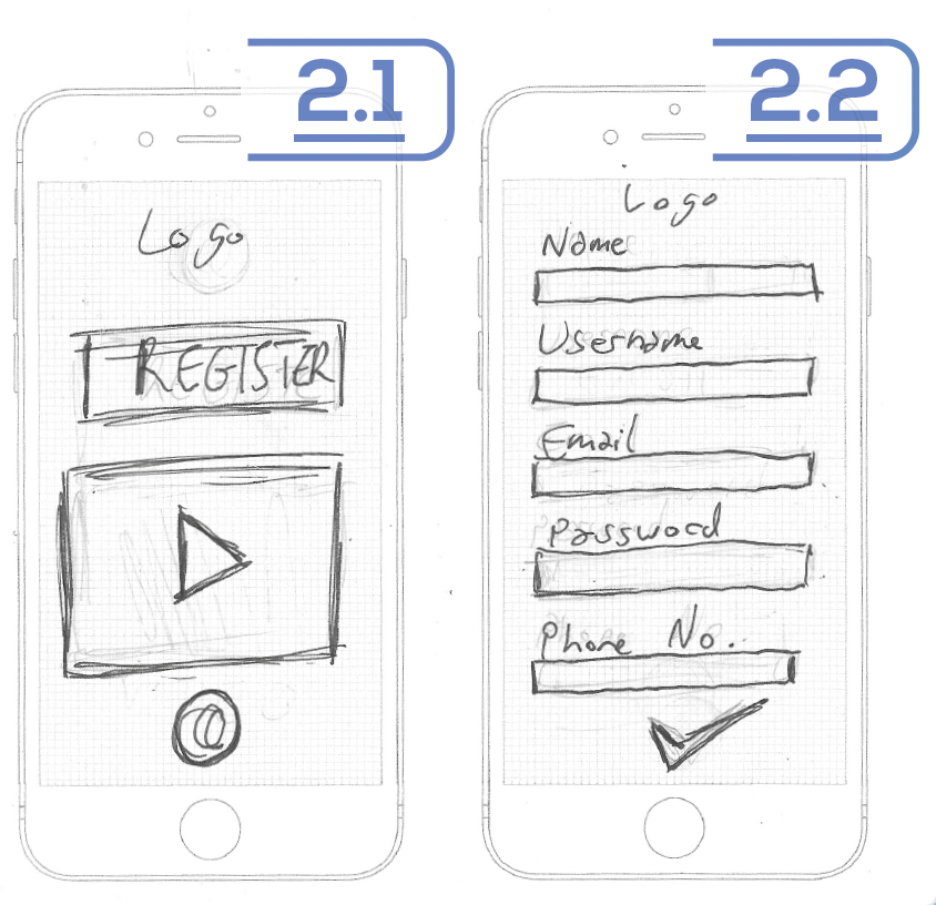
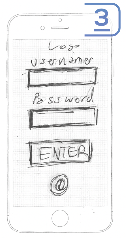
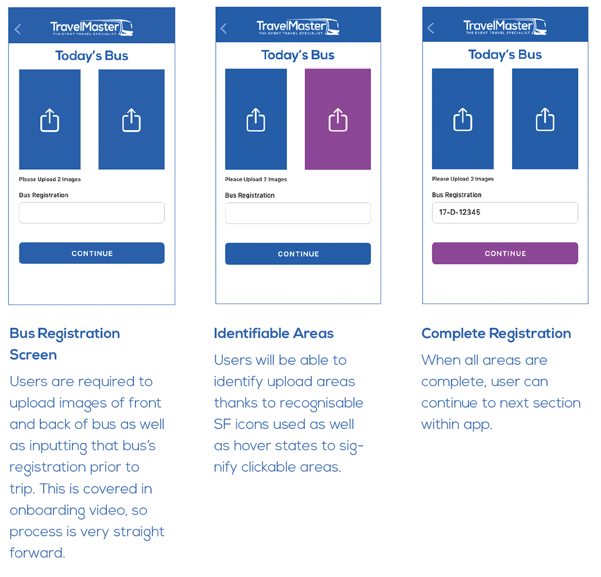
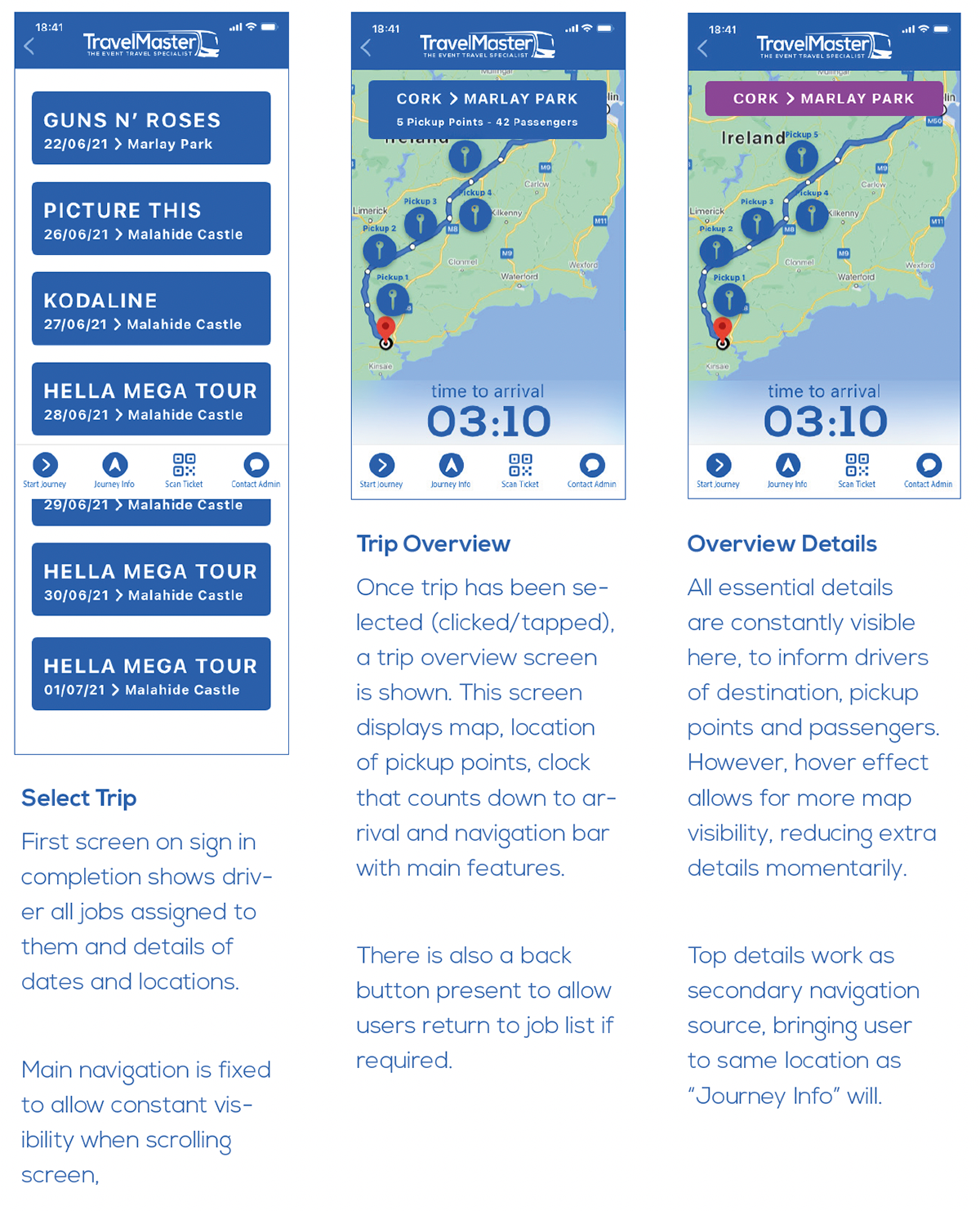
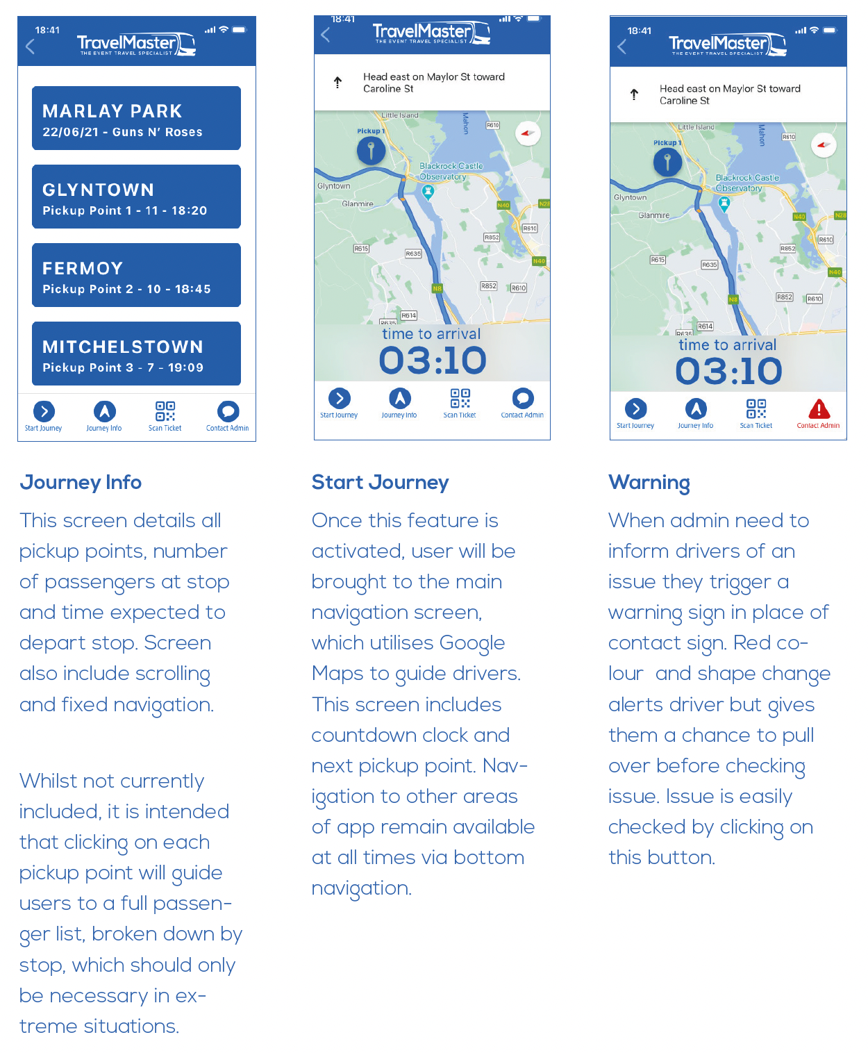
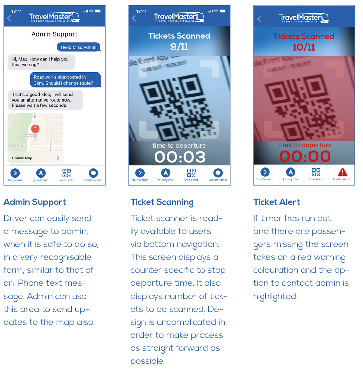
To create an efficient communications system that would allow bus drivers to obtain and relay important navigational information, a very simplistic itinerary was mocked up, to function as a dashboard. On other screens, when the company logo is clicked, the user will be guided back to this itinerary overview.
It was immediately evident that this app would have a variety of necessary functions, all requiring clear representation, which stands the risk of the interface being highly cluttered. It could be seen that easily recognisable symbols to annotate navigation in design will greatly impact app’s usability.
An MVP was created, with many iterations developed to refine the core requirements of the app, with rigorous user testing.
It was difficult testing prototypes with the specific user base. When bus drivers were not accessible to testing, those with specific skillsets and comprehension were sought out and briefed prior to testing. The experience also had to be simulated, as it was not possible to test it during a bus journey. The specific parameters sought for testers included: regular drivers who often picked up and dropped off passengers, those with experience driving large vehicles and adhering to specific transport schedules. The experience was then simulated in a scenario-based manner then. Testers were asked to put themselves in the mind frame of a driver about to embark of a journey. This was discussed to set the scene before testing.
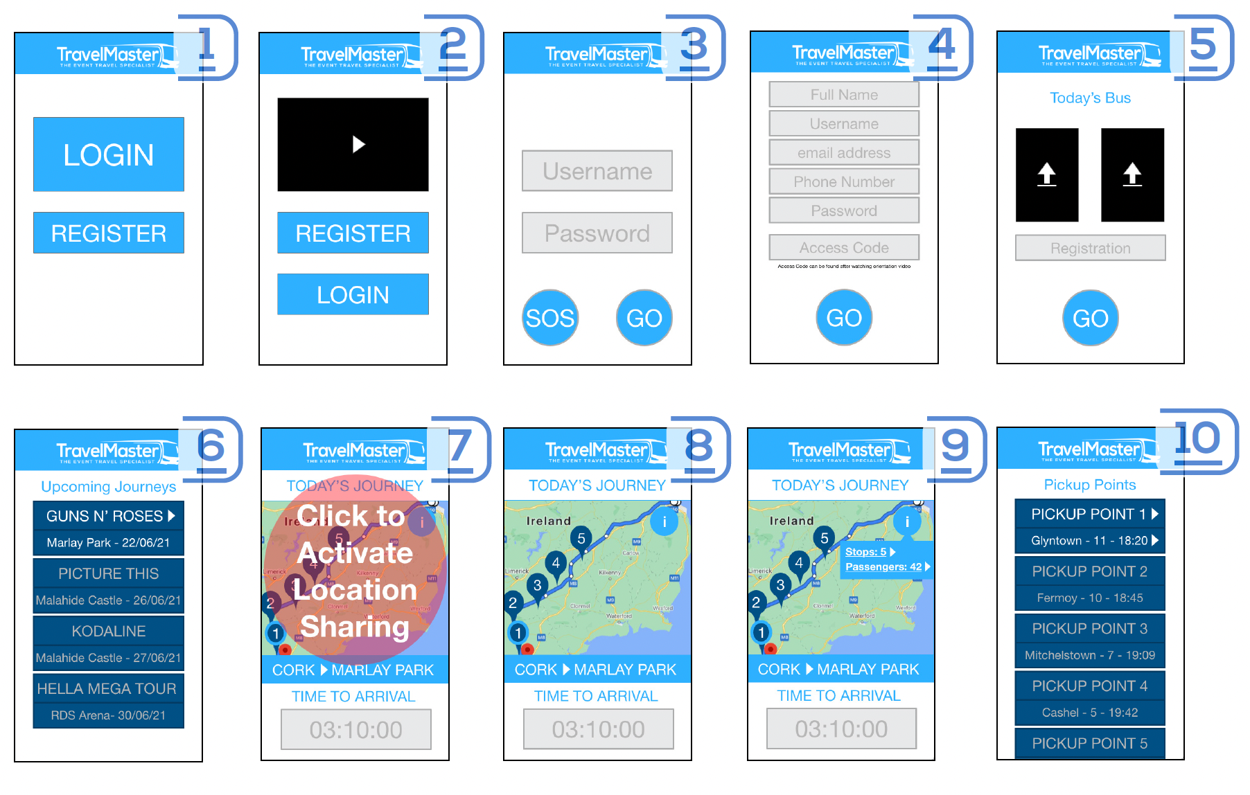
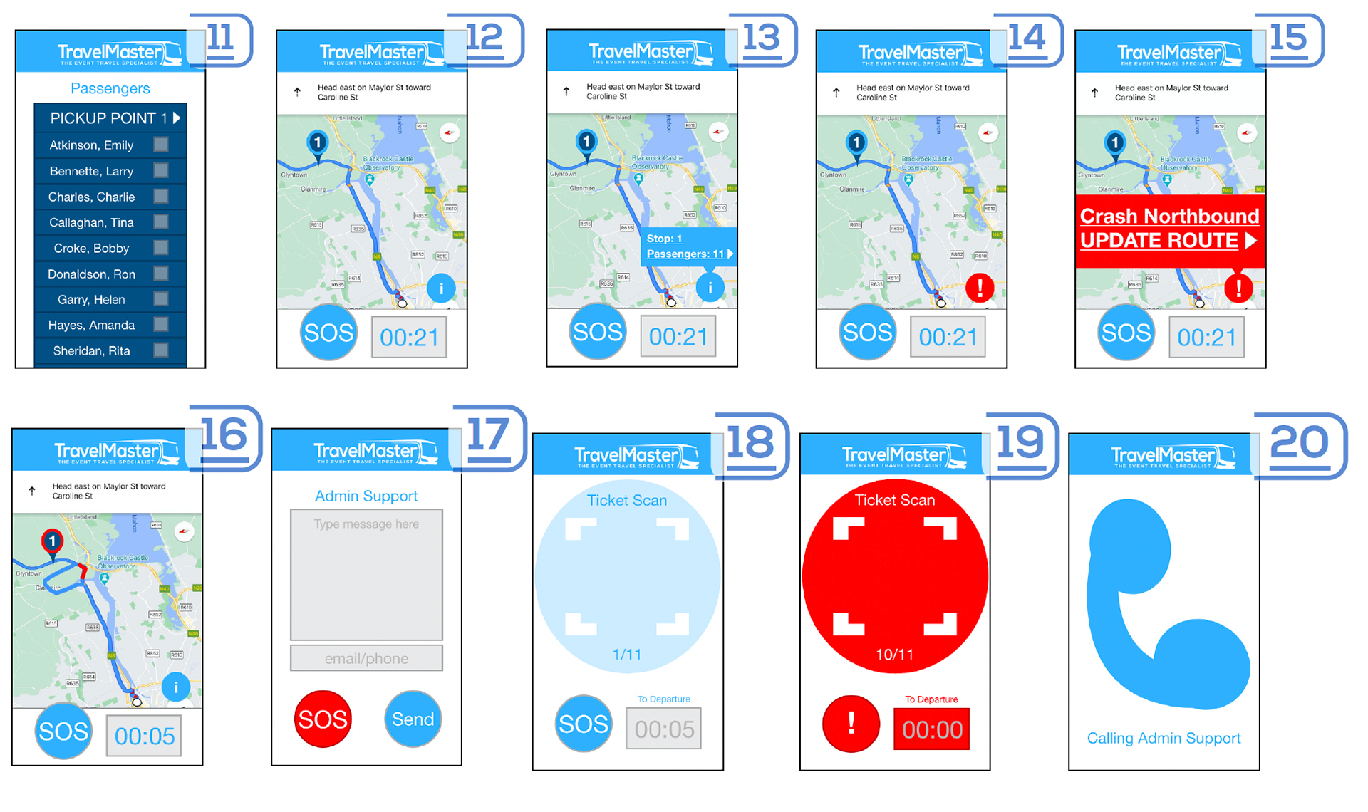
Prior to designing a high fidelity prototype, it was important to consider the branding and important mobile design principals.
Whilst the company wished to continue with their previously designed brand, there was an absence of information available to utilise the assets efficiently. Therefore, some optimisation to develop key components was undertaken. Psychological factors were considered when developing the visual design and interactions, with importance placed on cognitive load a number of heuristics such as default effect, scarcity heuristic, naïve diversification and fluency heuristic. Furthermore, interaction design principals such as Fitts’s Law were utilised, ensuring that targets are large enough to discern and accurately select with ease, have appropriate spacing between them and are placed in an area that allows them be acquired with ease.
Please visit the link below to prototype app:
